THAT DOESN`T MAKE ANY SENSE! - Pop Art Text Effect


Uses OpenAI GPT-Image-2.5 Sunburst, the model behind this artwork · 15 credits






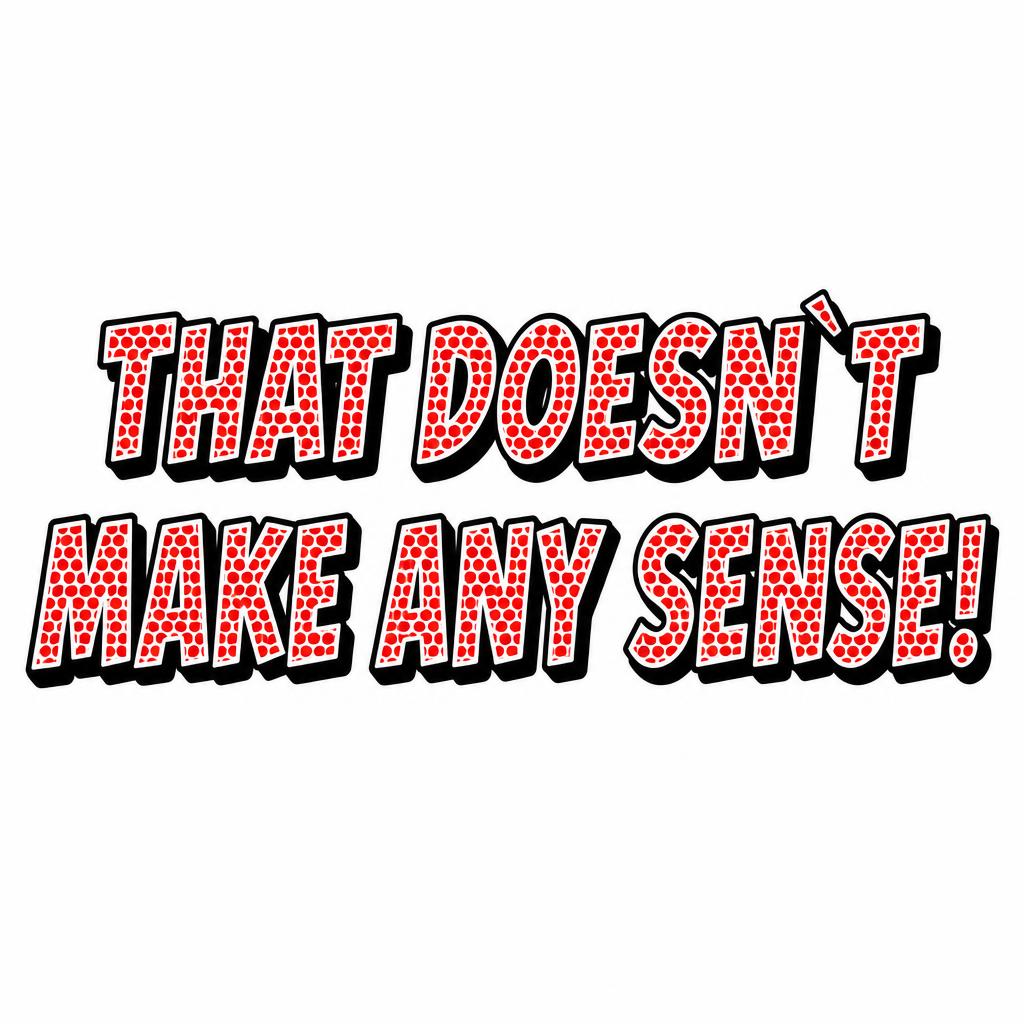
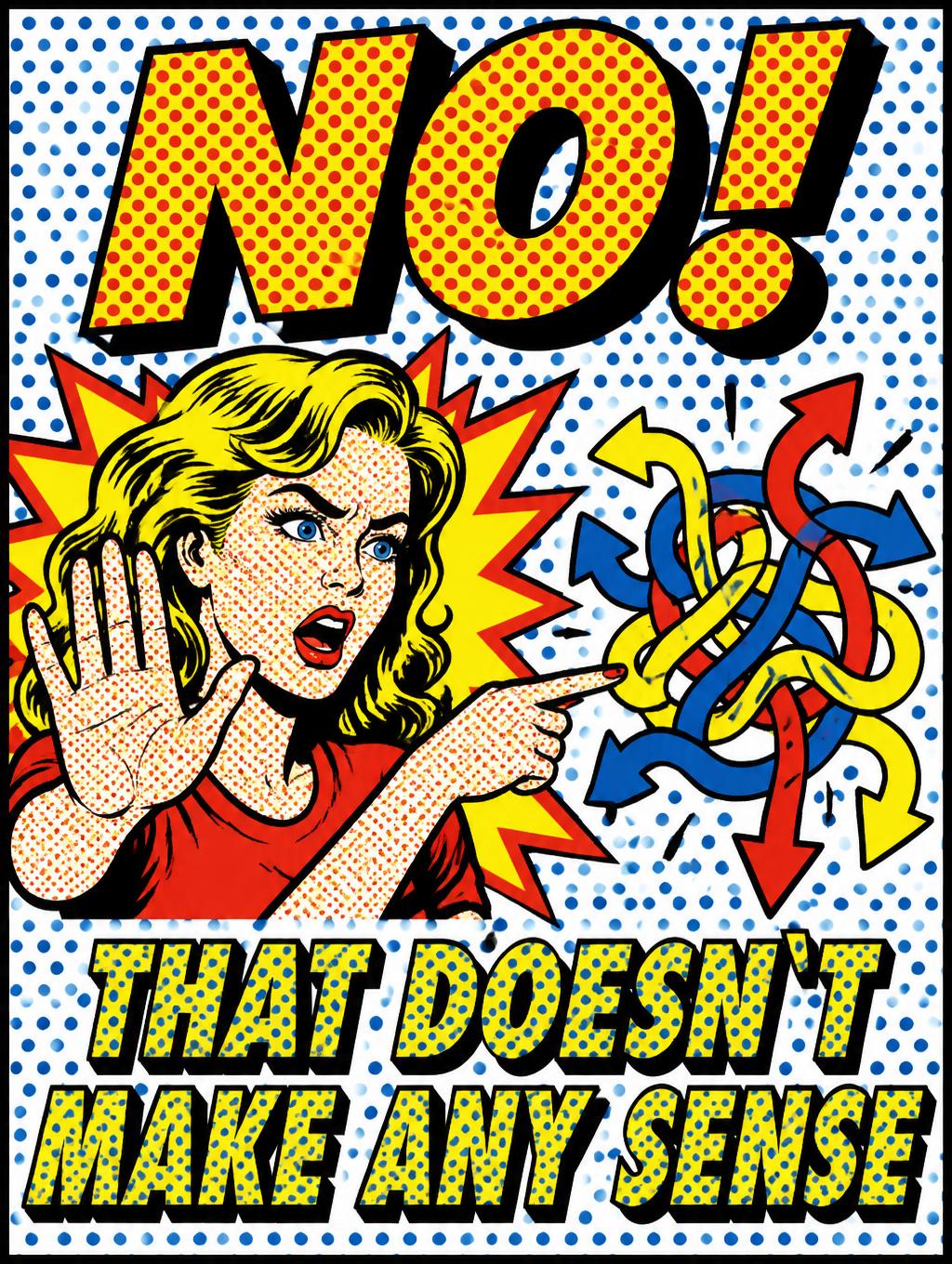
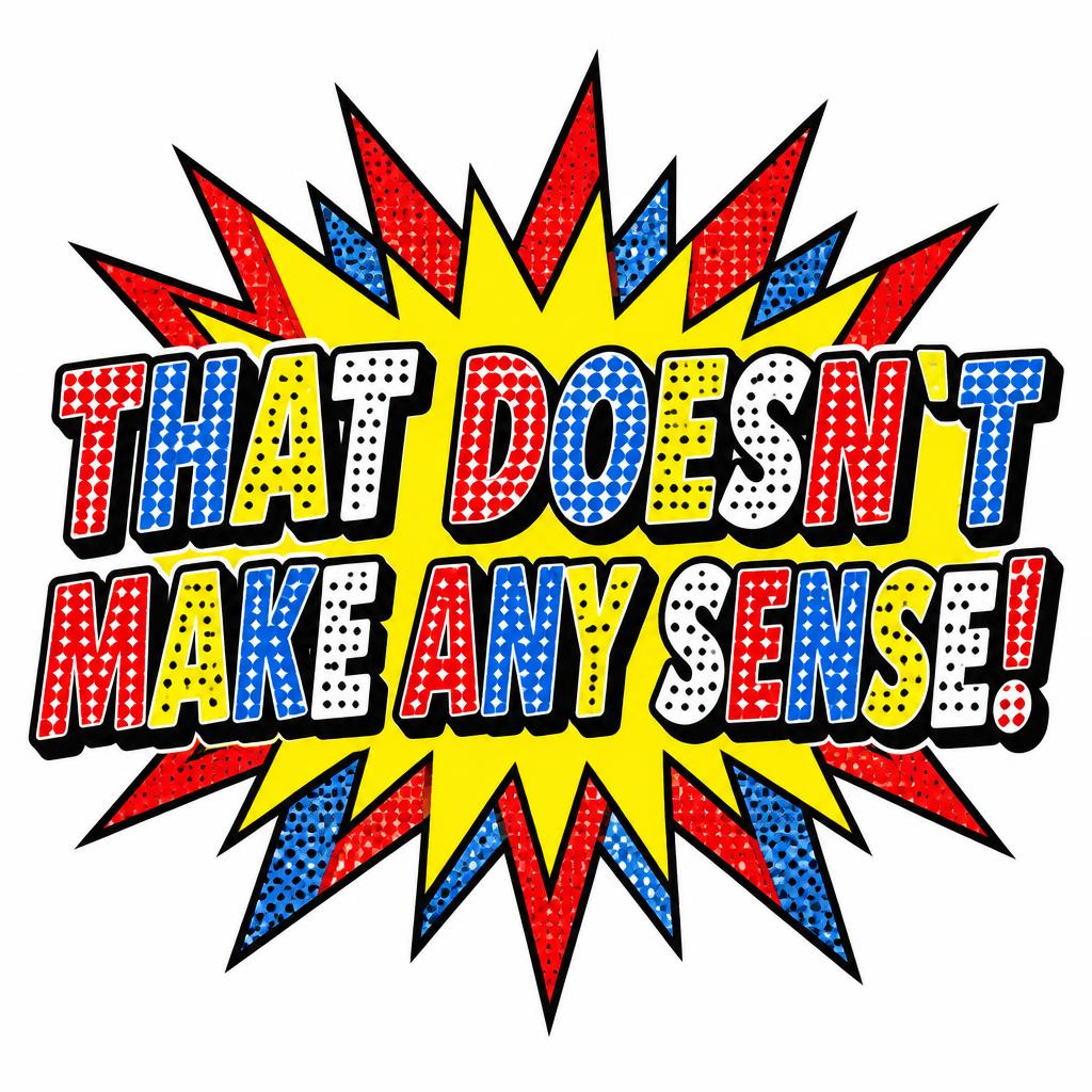
“THAT DOESN`T MAKE ANY SENSE!” was created with FontVibe AI — explore more Pop Art text effect. Lichtenstein comic capitals filled with Ben-Day dots in flat red and yellow, thick black outlines and a hard drop shadow, bursting from a starburst on a dotted blue ground.
Create a complete square typographic comic graphic on a clean, flat white background. Center the headline in exactly two lines, with generous white margins and no other wording. Render the exact text, preserving the backtick: first line “THAT DOESN`T”; second line “MAKE ANY SENSE!” Use bold, hand-traced comic display letterforms with broad strokes and compact spacing. Give every letter a thick, hard-edged, uniform black outer contour. Fill the letters with large, individually visible circular Ben-Day dots arranged on a precise 45-degree offset grid; use flat primary red, blue, yellow, and white fills in distinct letter sections, never blended. Leave a narrow bare white gap between each dot fill and the inner edge of its black outline. Add a solid black hard-edged drop shadow offset 45 degrees down-right. Place a flat jagged comic-book starburst behind the headline, with black-edged spikes in primary red and yellow and a few blue halftone areas; keep the overall background white and the burst clear of the letter contours. Crisp silk-screen edges, uniform dot size, high-contrast flat colors, no gradients, no photographic realism, no soft shadows, no extra text.
Generated on October 15, 2026 · 1024 × 1024 · JPEG · OpenAI GPT-Image-2.5 Sunburst · Layout: Centered Comic Stack · Shared by the creator · Free for commercial use (CC BY 4.0)