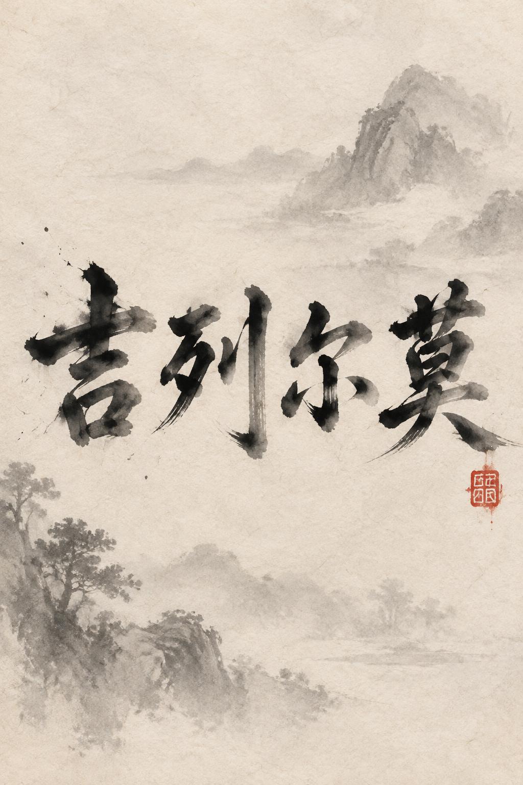
吉列尔莫 - Chinese Ink Brush Text Effect


Uses OpenAI GPT-Image-2.5 Sunburst, the model behind this artwork · 15 credits
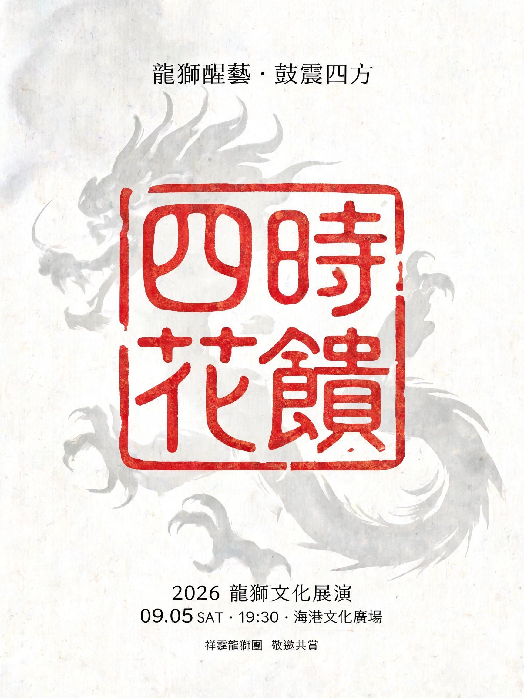
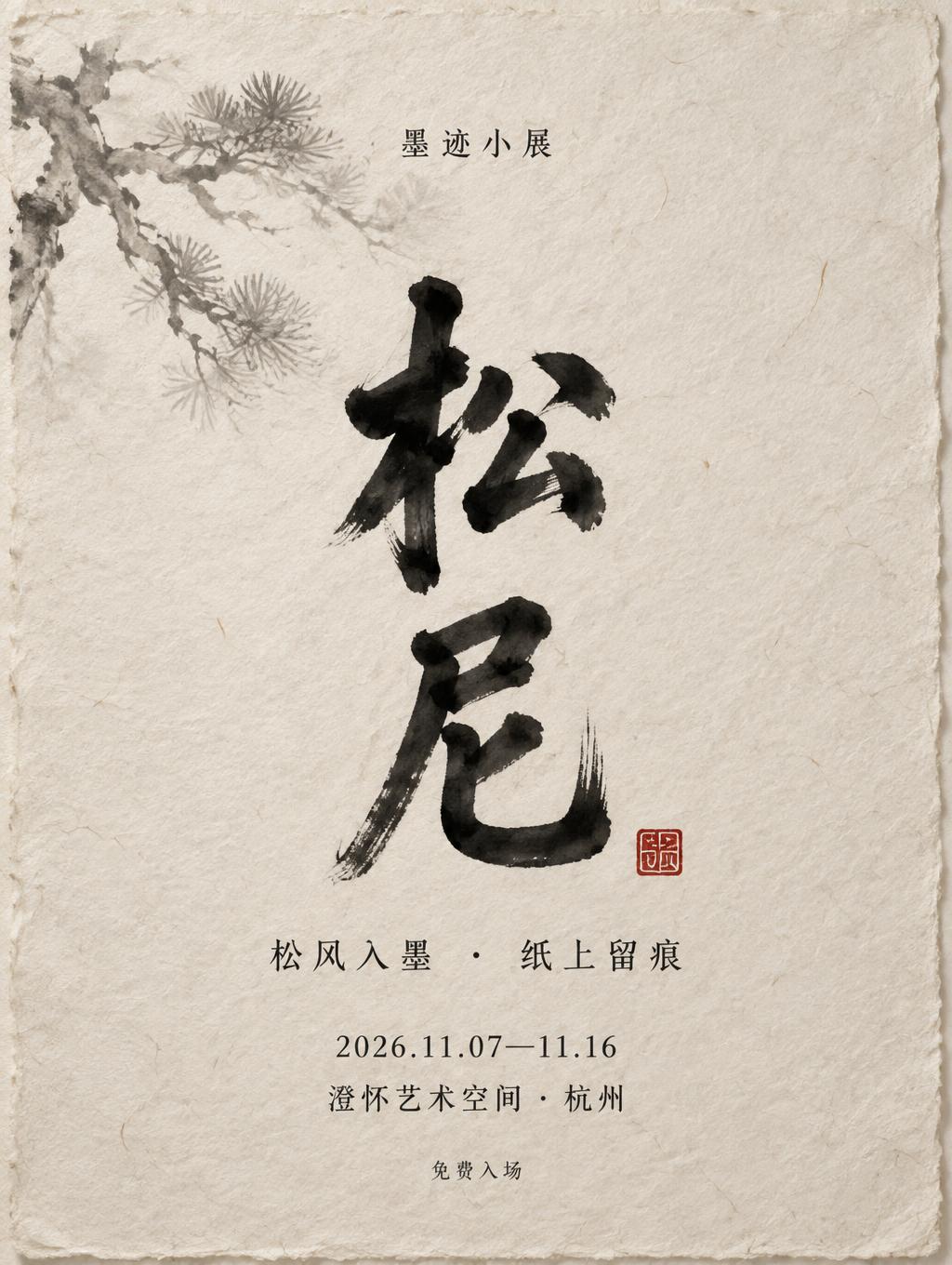
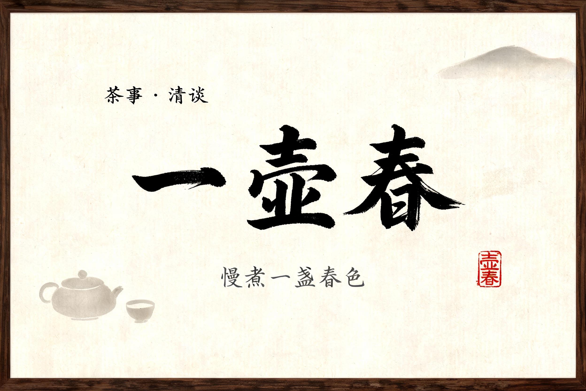


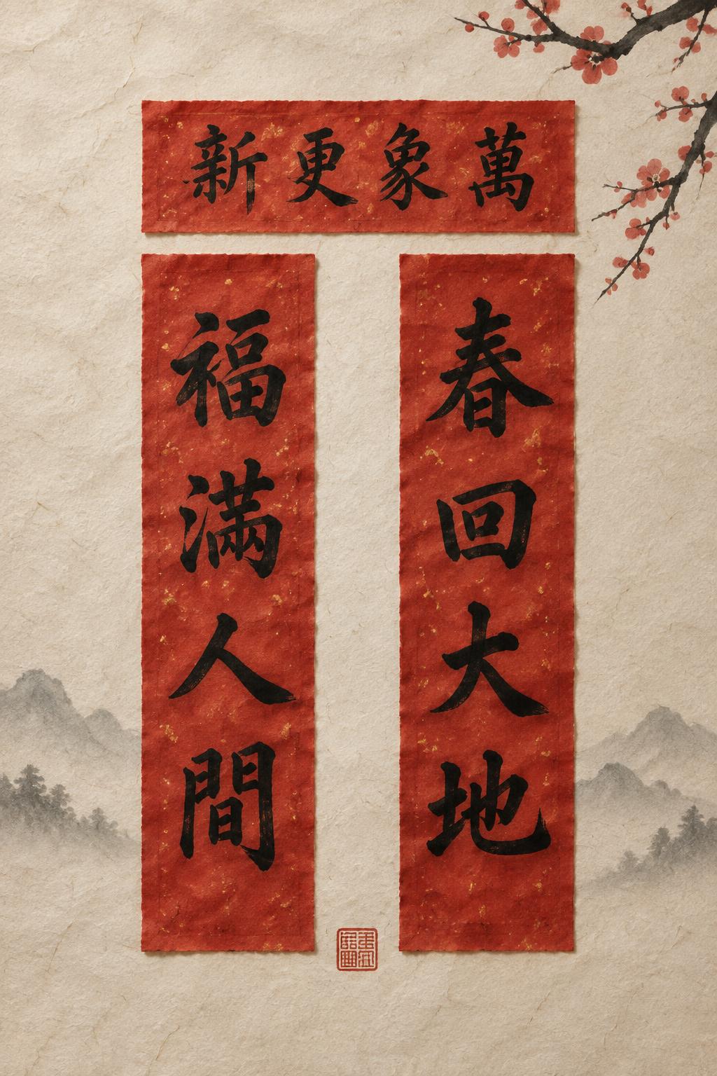
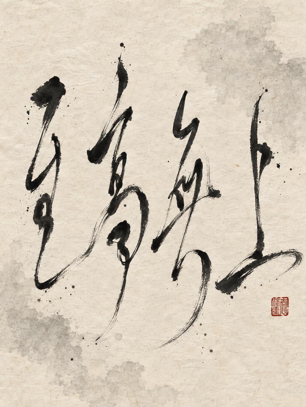
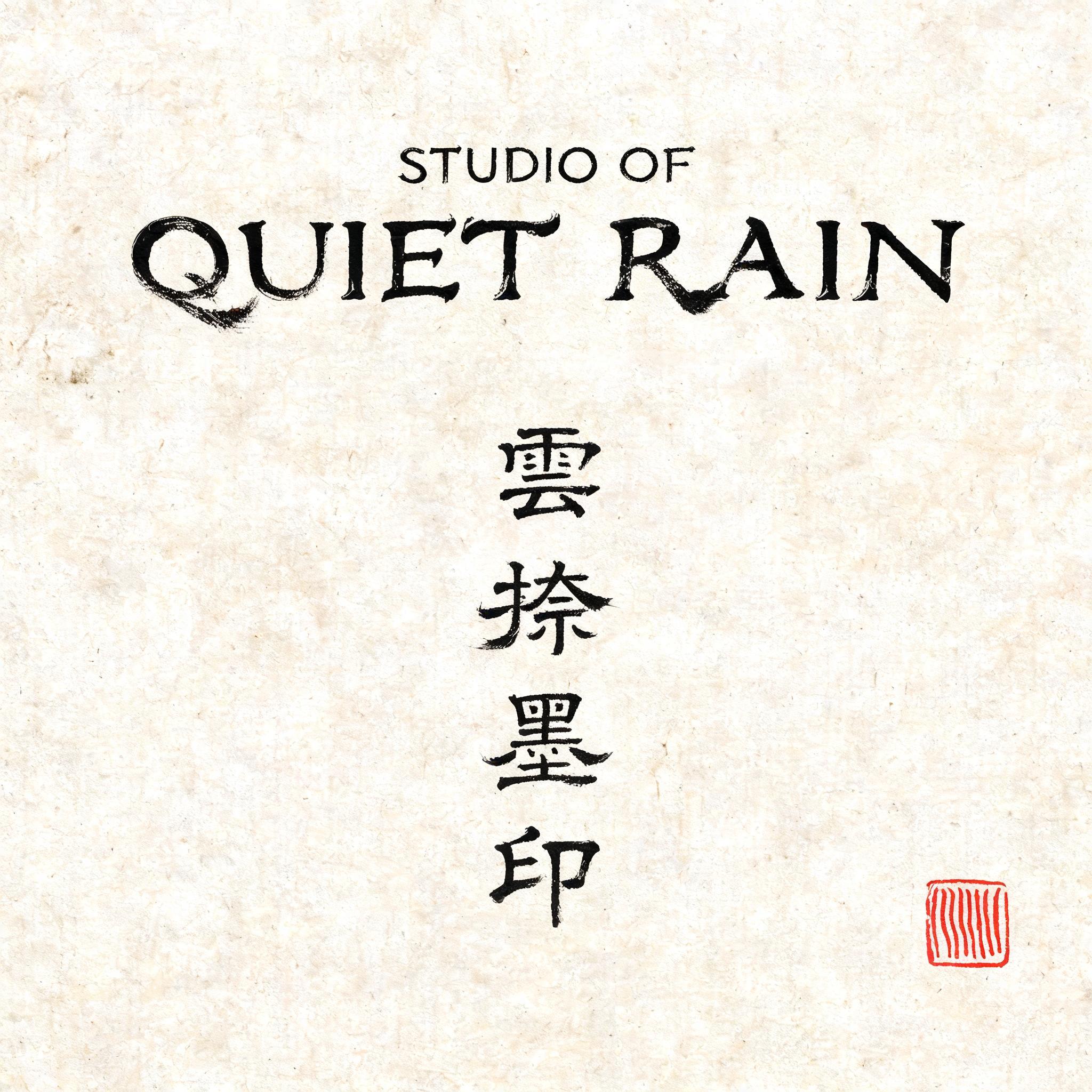

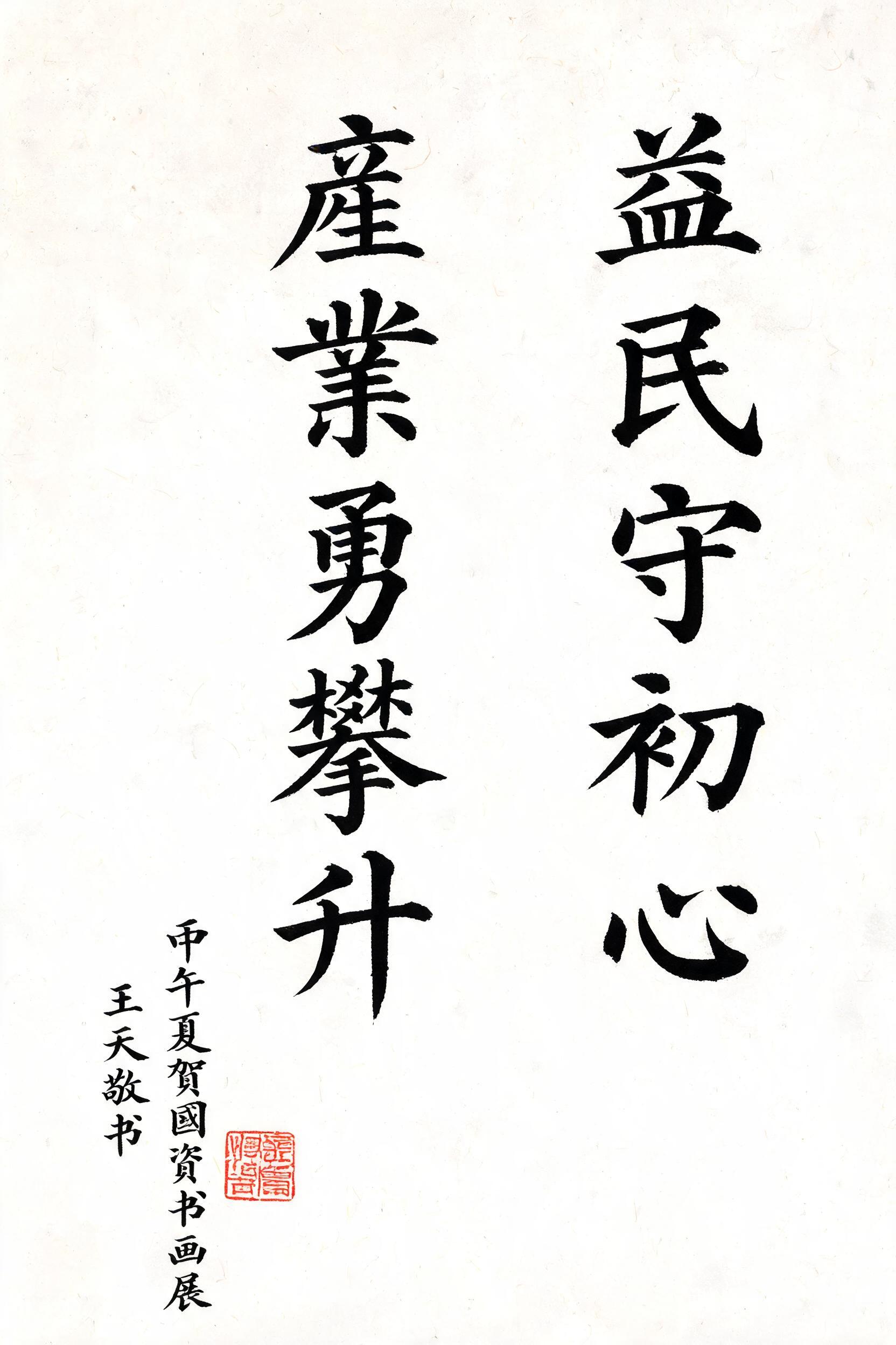
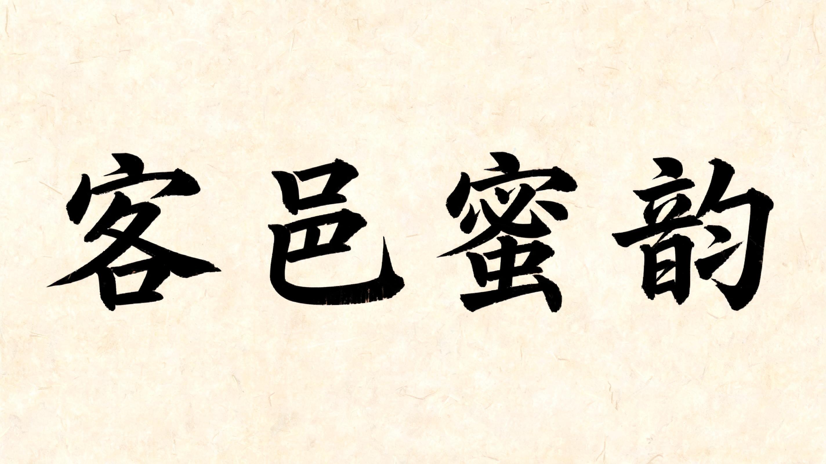

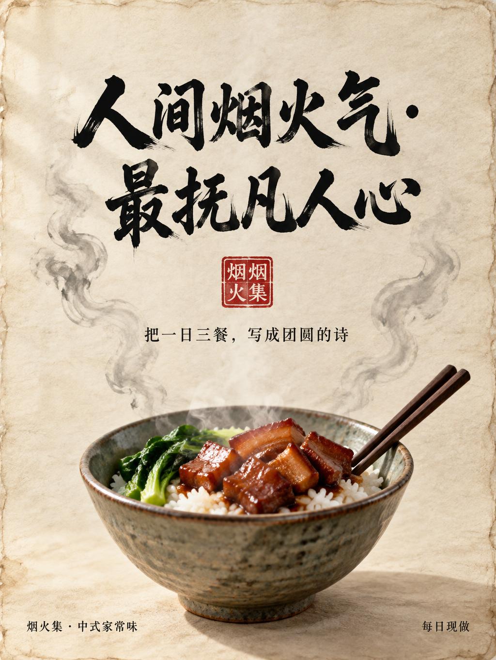
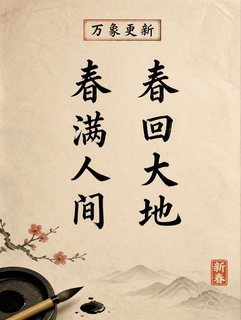
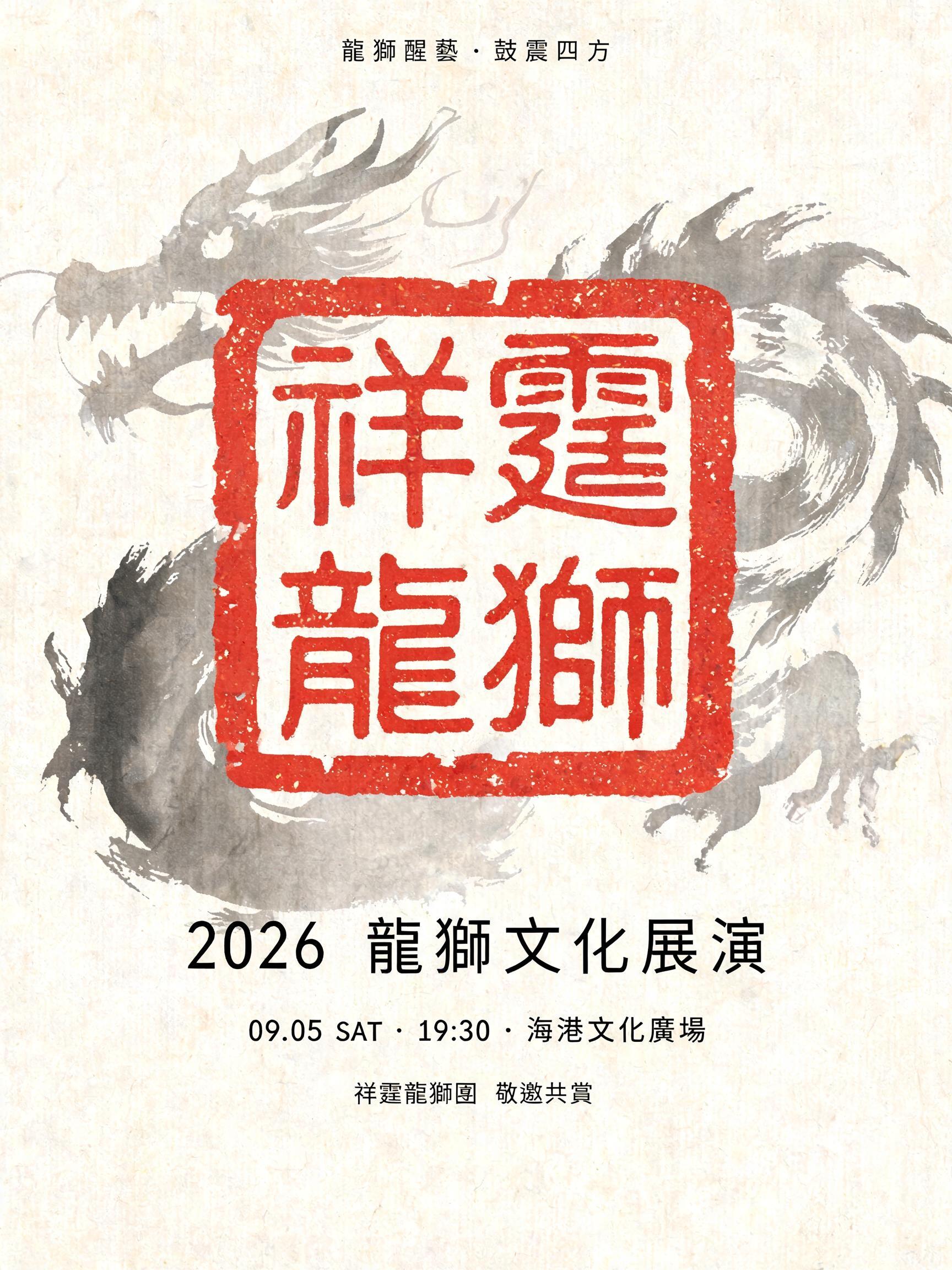


“吉列尔莫” was created with FontVibe AI — explore more Brush Chinese Ink text effect. Chinese sumi ink brush calligraphy style applied to Latin letterforms. Deep black ink with authentic bristle texture, thick-to-thin stroke variation, and rice paper atmosphere. Perfect for Chinese restaurant branding, martial arts, wellness, and cultural design.
rendered in Chinese ink brush calligraphy style. Letterforms painted with a fully loaded sumi ink brush — deep black ink, visible bristle marks along stroke edges, wet ink pooling at stroke starts, feathered dry-brush trailing ends. Authentic ink density variation: thick rich black cores fading to grey at thin passages. Rice paper texture visible behind. Traditional Chinese calligraphy energy — each stroke confident, intentional, irreversible. LETTERFORM PRIORITY: when the chosen font carries its own treatment, that font's letterform shapes take priority and own the letters; this style governs the sumi ink medium, the bristle and ink-density behavior and the rice-paper ground. FALLBACK MATERIAL: if the font carries no material of its own, render the letters as deep black sumi brush strokes with visible bristle marks, wet ink pooling at stroke starts and feathered dry-brush trails on rice paper. COLOR PRIORITY: keep the font's own colors if specified; otherwise rich black ink fading to grey at thin passages. Four-character Chinese name 吉列尔莫 rendered as a confident, expressive sumi ink composition on warm ivory xuan paper. Rich black ink gathers heavily at decisive stroke beginnings, then shifts through charcoal grey into feathered dry-brush finishes, with individual bristle hairs visible where the brush lifts. The characters carry a dignified, ceremonial calm, each mark alive with irreversible hand-painted energy rather than uniform digital cleanliness. Fine paper fibers emerge through translucent ink passages; subtle capillary bleed softens select edges and tiny ink droplets appear near the most forceful turns. A restrained pale grey ink-wash bloom drifts behind the lettering, suggesting distant mountain mist without competing with the name. Leave abundant luminous paper breathing room around the marks. A small imperfect vermilion scholar’s seal impression and a faint red mineral-pigment smudge provide one measured accent. The overall image feels like a treasured calligraphy study: tactile, balanced, quietly powerful, with deep wet blacks against aged handmade paper.
Made for Chinese Font Generator
Generated on October 17, 2026 · 1024 × 1536 · JPEG · OpenAI GPT-Image-2.5 Sunburst · Shared by the creator · Free for commercial use (CC BY 4.0)


