


AI Gothic Font Text Effect Generator
Gothic font generator powered by AI. Create authentic blackletter, old english, fraktur, and gothic calligraphy text effects in seconds. Choose from classic Textura blackletter to ornate Victorian gothic — each style rendered with precise letter construction and rich ink textures. Perfect for brand logos, tattoo lettering, music posters, wedding invitations, and any design that demands typographic authority. — no font license needed.


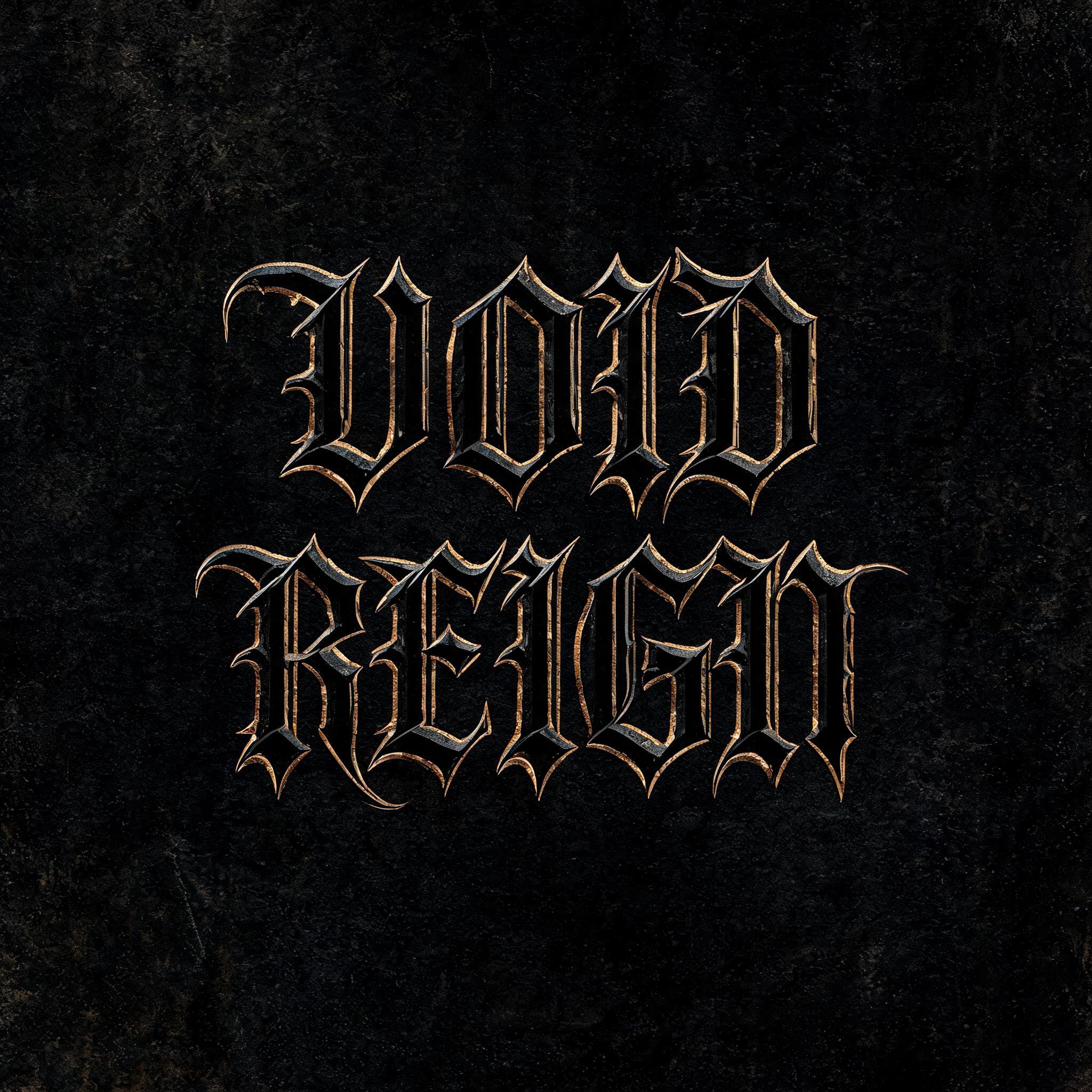

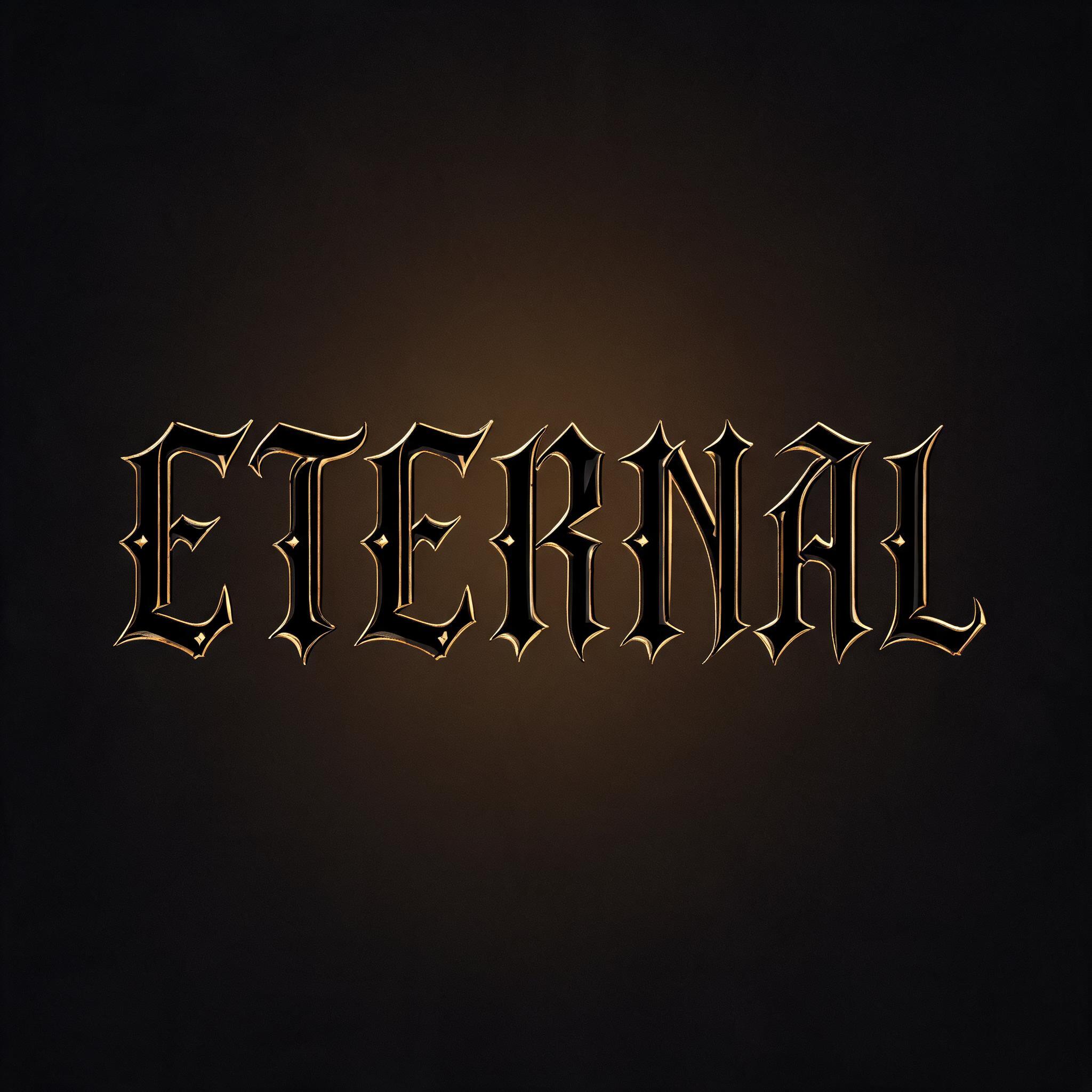
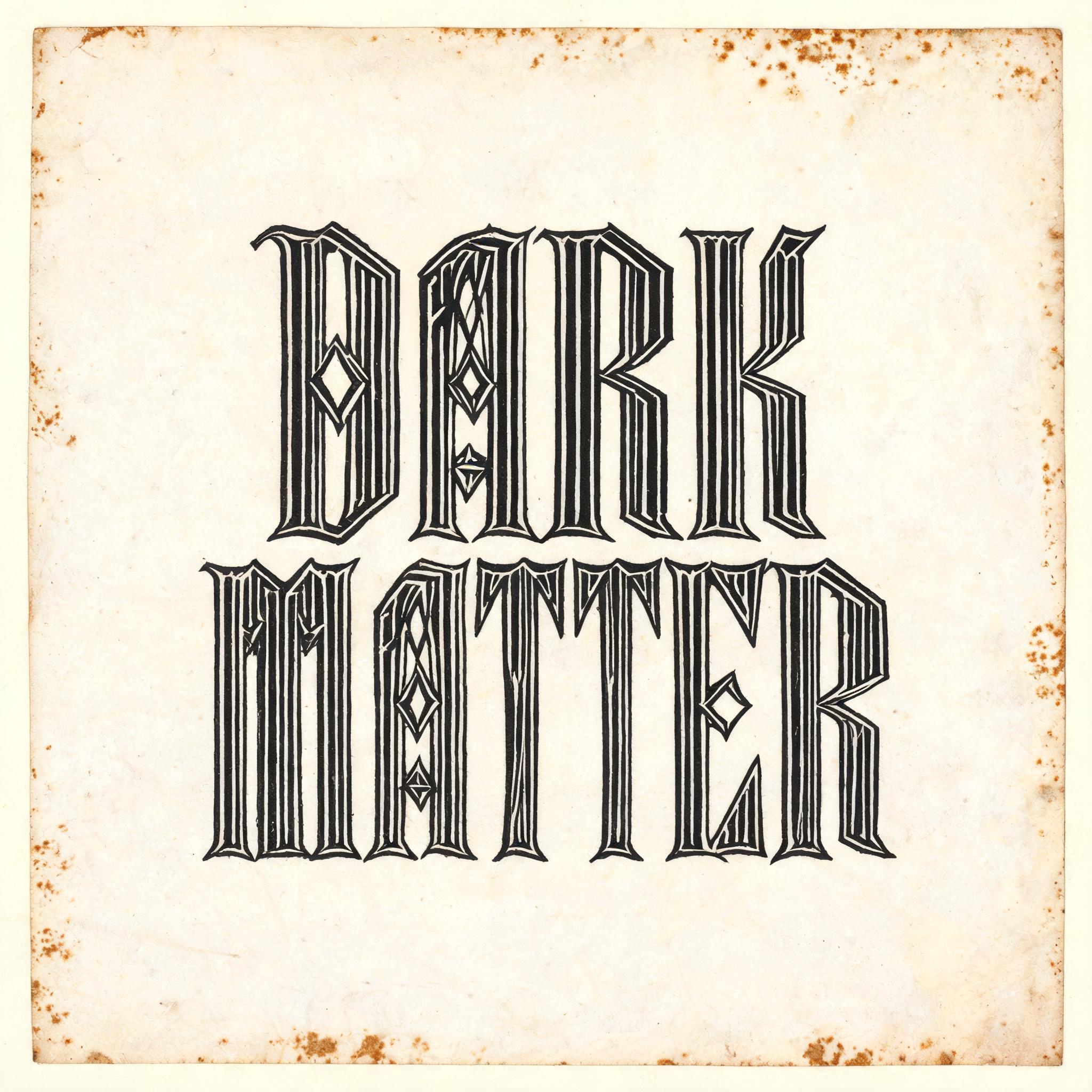
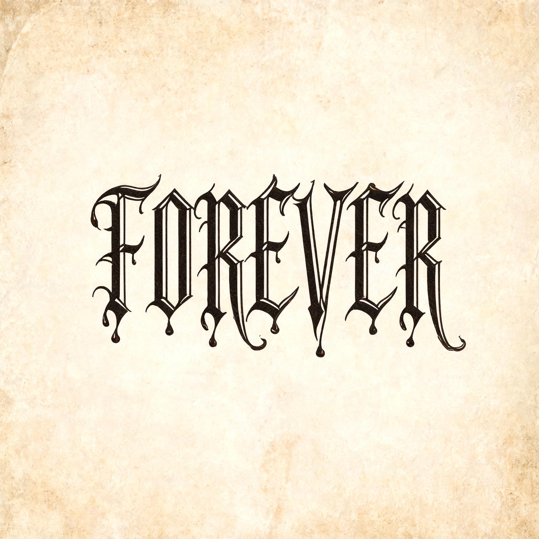
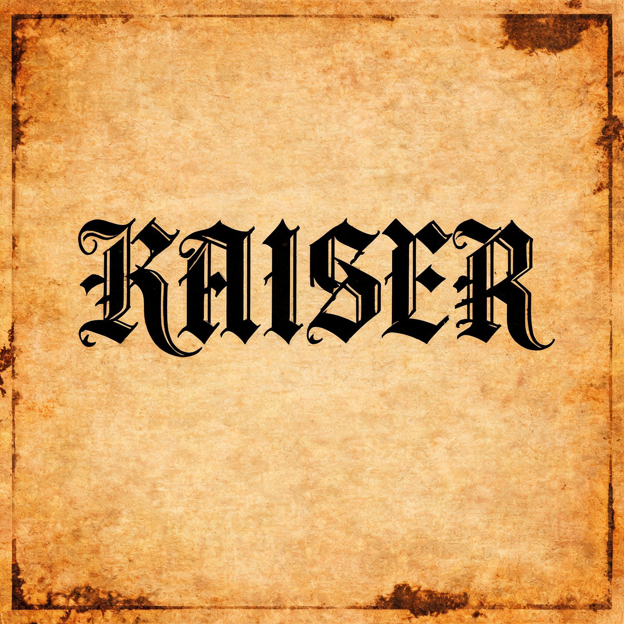
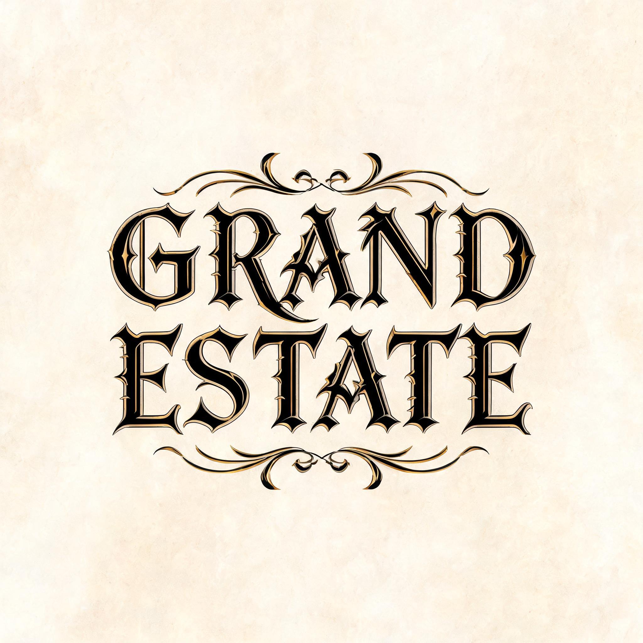


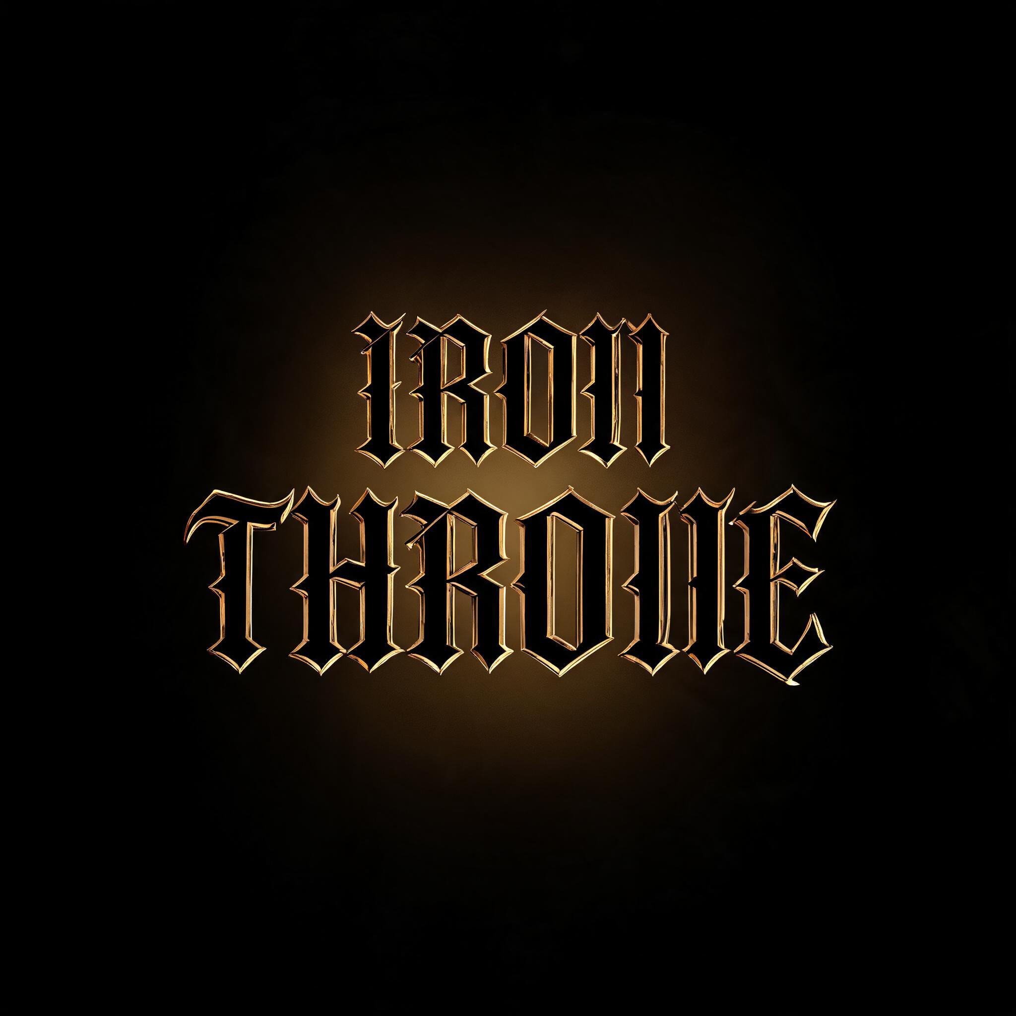


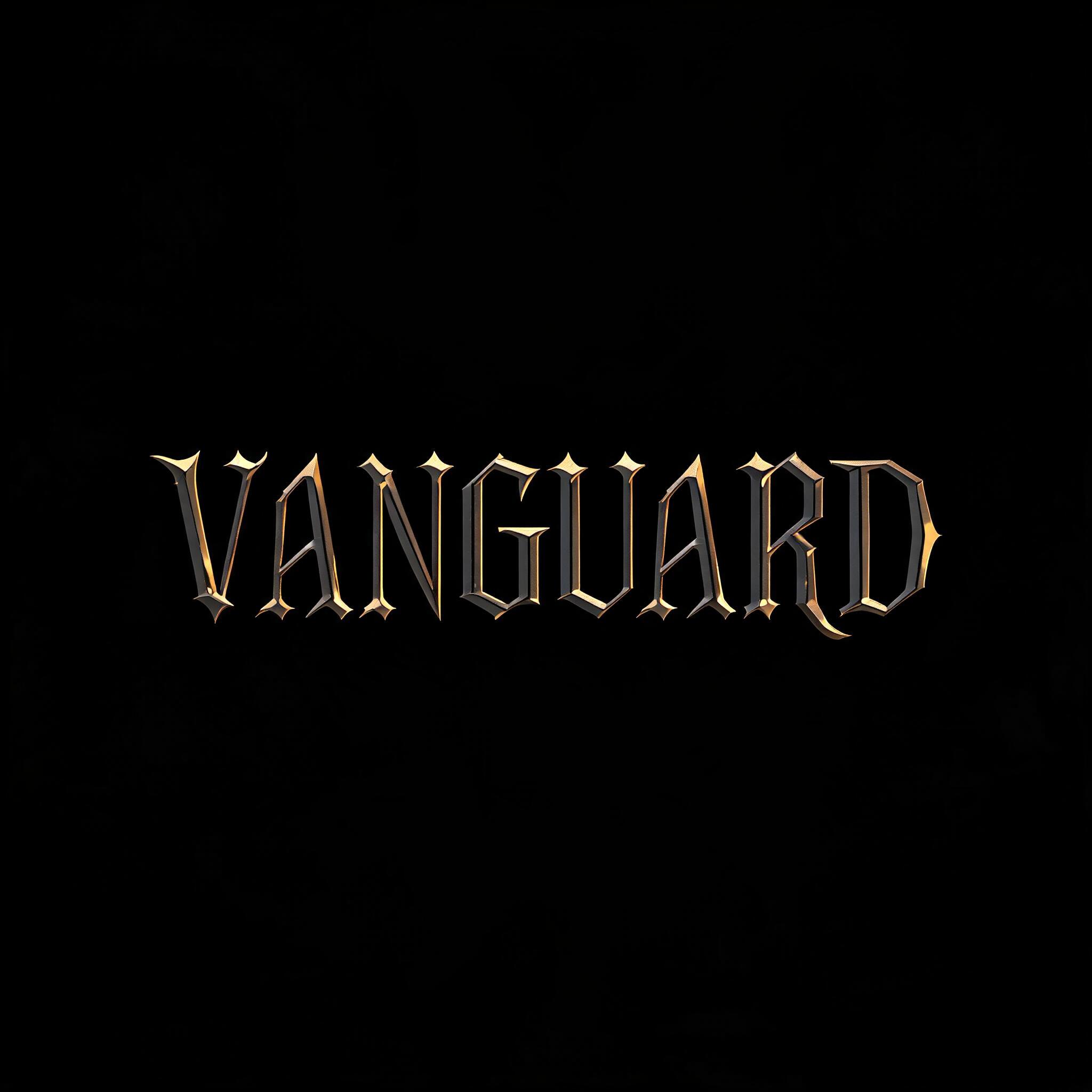


Gothic Font Gallery
Real outputs from the Gothic Font style. Click any image to see details.


Looking for copy-paste fancy text? Try our free Font Generator Tools — cursive, gothic, bubble & 30+ styles.
Perfect for These Projects
Gothic Font Text Effect — FAQ
What is the Gothic Font Font Style?
The Gothic Font font style is a distinctive AI-generated typography effect. Gothic font generator powered by AI. Create authentic blackletter, old english, fraktur, and gothic calligraphy text effects in seconds. Choose from classic Textura blackletter to ornate Victorian gothic — each style rendered with precise letter construction and rich ink textures. Perfect for brand logos, tattoo lettering, music posters, wedding invitations, and any design that demands typographic authority. Using FontVibe's AI gothic font generator you can create stunning text effects in seconds — no Photoshop, no font licensing, no design experience needed.
Explore the Gothic Font gallery for inspiration, or browse all 122+ AI text effect styles available on FontVibe.
How to Create Gothic Font Typography in FontVibe Studio
The Story Behind Gothic Font
History, visual DNA, and cultural context.
When Architecture Became Type
The word "gothic" as a typographic term is a historical accident that has caused confusion for 500 years. In the 15th century, Italian Renaissance humanists needed a term for the dense, vertical letterforms used north of the Alps — the script of Germany, Flanders, and England. They borrowed the name of the architectural style they also disliked: "gothic," meaning barbarian, meaning northern, meaning not-Roman.
The letterforms themselves — blackletter, textura, Fraktur, depending on the specific regional tradition — were not barbaric. They were the product of centuries of monastic scribal culture, optimized for the specific demands of quill on vellum: dense, efficient, maximizing characters per line while maintaining a consistent vertical rhythm. Gutenberg's movable type, designed to imitate the manuscripts scribes produced, was blackletter. The first major book printed in Europe used what we now call gothic type.
The Romantic movement of the 19th century reclaimed gothic as an aesthetic — Gothic literature, Gothic Revival architecture, Gothic typefaces — all drawing on the same vocabulary of verticality, darkness, and pointed forms. By the late 20th century, gothic had become the visual language of a subculture: the aesthetic of Joy Division, The Cure, Siouxsie and the Banshees, and a generation of teenagers who found something true in its rejection of brightness.
The Visual DNA
In Typography
Gothic typography has an unusual relationship with legibility: it was perfectly legible to readers trained on it, and largely illegible to readers who weren't. German newspapers used Fraktur until 1941, when the government ordered a switch to Roman type — partly for practical reasons, partly because Fraktur had become associated with German national identity in ways that were politically complicated.
For contemporary use, gothic letterforms work in contexts where the associations (permanence, darkness, ritual, authenticity) outweigh the legibility costs. Metal band logos, tattoo-style lettering, luxury spirits labeling, and newspaper masthead design are the established territories. The New York Times has used blackletter since 1857 — the type IS the brand's authority signal.
The specific quality that digital tools struggle to reproduce: the slight lateral compression that comes from scribal writing angle, and the micro-variation in stroke width that distinguishes genuine calligraphic blackletter from type that is merely shaped like blackletter.
Did You Know?
The New York Times masthead has used blackletter continuously since 1857. When the paper experimented with a more modern masthead in the 1960s, reader response was negative enough that the change was reversed. The blackletter reads as "newspaper of record" so strongly that changing it would undermine the publication's authority — a rare case where a typeface is untouchable.
The illegibility of metal band logos — particularly the dense blackletter and angular scripts of black metal — is intentional. Logos of bands like Mayhem and Darkthrone are designed to be difficult for the general public to read. Legibility would imply accessibility; the genre is explicitly hostile to it.
The "gothic" designation applied by Italian humanists in the 15th century was meant as an insult — equating northern European letterforms with the barbarian Goths who sacked Rome. Germany still calls these letterforms Deutsche Schrift (German script). One culture's slur became another culture's pride.
Create Your Gothic Font Typography in Studio
Free to start. No design skills needed. Your artwork, your copyright.
AI Gothic Font Text Effect Generator
Generate Your Gothic Font Text Effect
Type any word — see it transformed in seconds. No sign-up required.
Gothic Font Style Gallery
Real outputs from the Gothic Font style. Click any image to see details.


Similar Text Effect Styles
Try these styles and create your own AI-generated text effects.
Looking for copy-paste fancy text? Try our free Font Generator Tools — cursive, gothic, bubble & 30+ styles.
Perfect for These Projects
Gothic Font text effects are popular for creative projects where visual impact matters.
What is the Gothic Font Font Style?
The Gothic Font font style is a distinctive AI-generated typography effect. Gothic font generator powered by AI. Create authentic blackletter, old english, fraktur, and gothic calligraphy text effects in seconds. Choose from classic Textura blackletter to ornate Victorian gothic — each style rendered with precise letter construction and rich ink textures. Perfect for brand logos, tattoo lettering, music posters, wedding invitations, and any design that demands typographic authority.
Using FontVibe's AI gothic font generator you can create stunning text effects in seconds — no Photoshop, no font licensing, no design experience needed.
Explore the Gothic Font gallery for inspiration, or browse all 122+ AI text effect styles available on FontVibe.
How to Create Gothic Font Typography in FontVibe Studio
1. Enter your text — Any word, phrase, or brand name. Works best with short, punchy text.
2. Select Gothic Font — From the style library. Optionally describe a mood in the custom prompt.
3. Generate and download. Your Gothic Font font artwork is ready in seconds. PNG, JPG, or transparent PNG.
Looking for something different? Browse the full font style library for more AI typography options.
Gothic Font Text Effect — FAQ
The Story Behind Gothic Font
History, visual DNA, and cultural context — everything that makes this style what it is.
When Architecture Became Type
The word "gothic" as a typographic term is a historical accident that has caused confusion for 500 years. In the 15th century, Italian Renaissance humanists needed a term for the dense, vertical letterforms used north of the Alps — the script of Germany, Flanders, and England. They borrowed the name of the architectural style they also disliked: "gothic," meaning barbarian, meaning northern, meaning not-Roman.
The letterforms themselves — blackletter, textura, Fraktur, depending on the specific regional tradition — were not barbaric. They were the product of centuries of monastic scribal culture, optimized for the specific demands of quill on vellum: dense, efficient, maximizing characters per line while maintaining a consistent vertical rhythm. Gutenberg's movable type, designed to imitate the manuscripts scribes produced, was blackletter. The first major book printed in Europe used what we now call gothic type.
The Romantic movement of the 19th century reclaimed gothic as an aesthetic — Gothic literature, Gothic Revival architecture, Gothic typefaces — all drawing on the same vocabulary of verticality, darkness, and pointed forms. By the late 20th century, gothic had become the visual language of a subculture: the aesthetic of Joy Division, The Cure, Siouxsie and the Banshees, and a generation of teenagers who found something true in its rejection of brightness.
The Visual DNA
In Typography
Gothic typography has an unusual relationship with legibility: it was perfectly legible to readers trained on it, and largely illegible to readers who weren't. German newspapers used Fraktur until 1941, when the government ordered a switch to Roman type — partly for practical reasons, partly because Fraktur had become associated with German national identity in ways that were politically complicated.
For contemporary use, gothic letterforms work in contexts where the associations (permanence, darkness, ritual, authenticity) outweigh the legibility costs. Metal band logos, tattoo-style lettering, luxury spirits labeling, and newspaper masthead design are the established territories. The New York Times has used blackletter since 1857 — the type IS the brand's authority signal.
The specific quality that digital tools struggle to reproduce: the slight lateral compression that comes from scribal writing angle, and the micro-variation in stroke width that distinguishes genuine calligraphic blackletter from type that is merely shaped like blackletter.
Did You Know?
The New York Times masthead has used blackletter continuously since 1857. When the paper experimented with a more modern masthead in the 1960s, reader response was negative enough that the change was reversed. The blackletter reads as "newspaper of record" so strongly that changing it would undermine the publication's authority — a rare case where a typeface is untouchable.
The illegibility of metal band logos — particularly the dense blackletter and angular scripts of black metal — is intentional. Logos of bands like Mayhem and Darkthrone are designed to be difficult for the general public to read. Legibility would imply accessibility; the genre is explicitly hostile to it.
The "gothic" designation applied by Italian humanists in the 15th century was meant as an insult — equating northern European letterforms with the barbarian Goths who sacked Rome. Germany still calls these letterforms Deutsche Schrift (German script). One culture's slur became another culture's pride.