


AI Anime Text Effect Generator
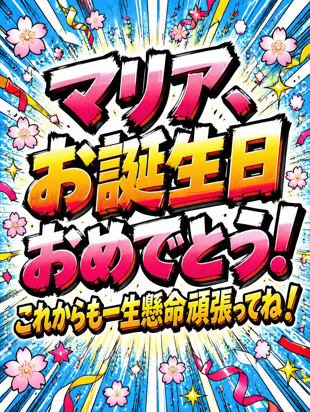
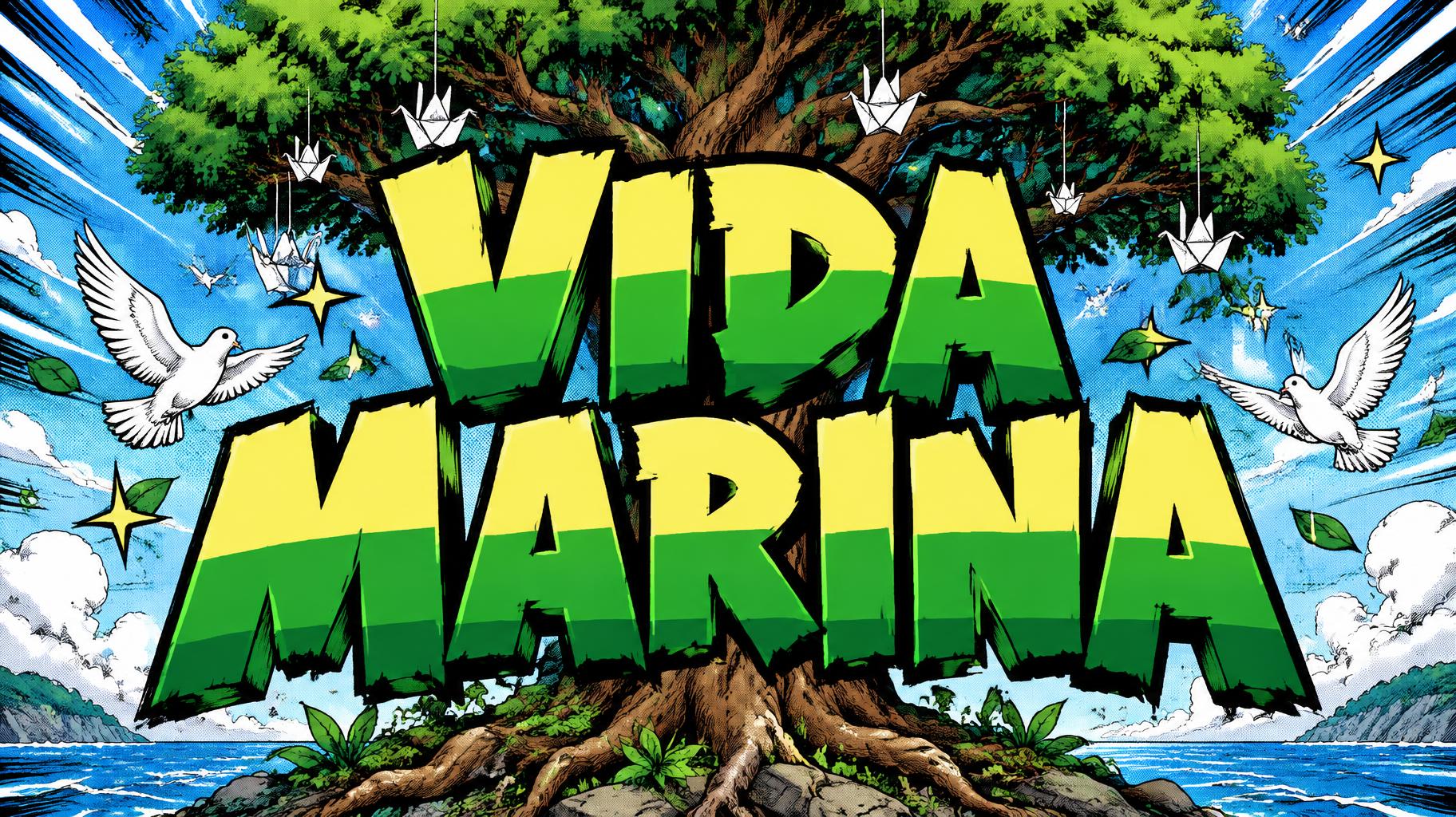
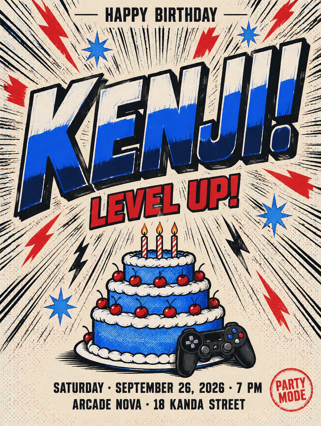
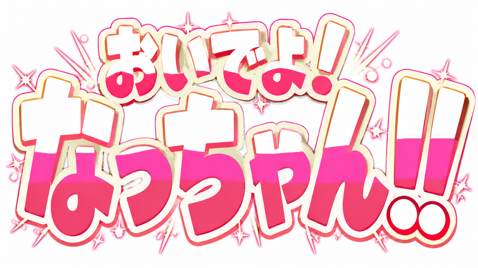
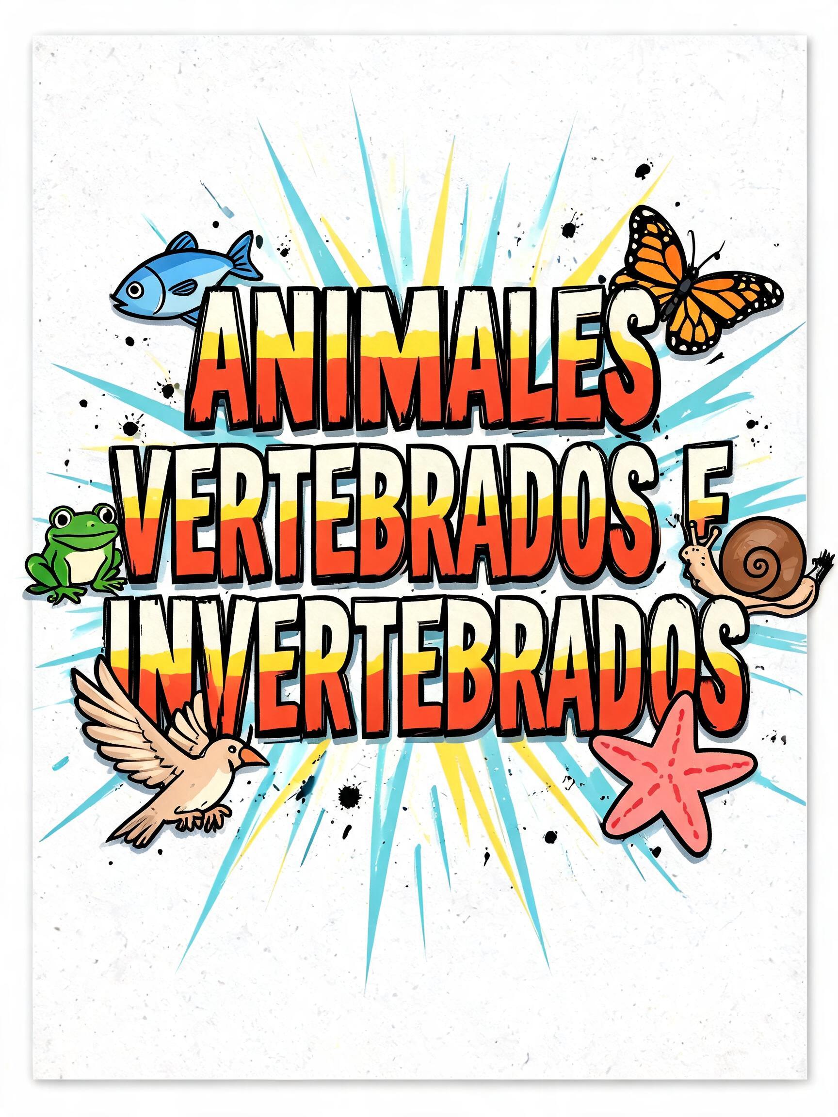
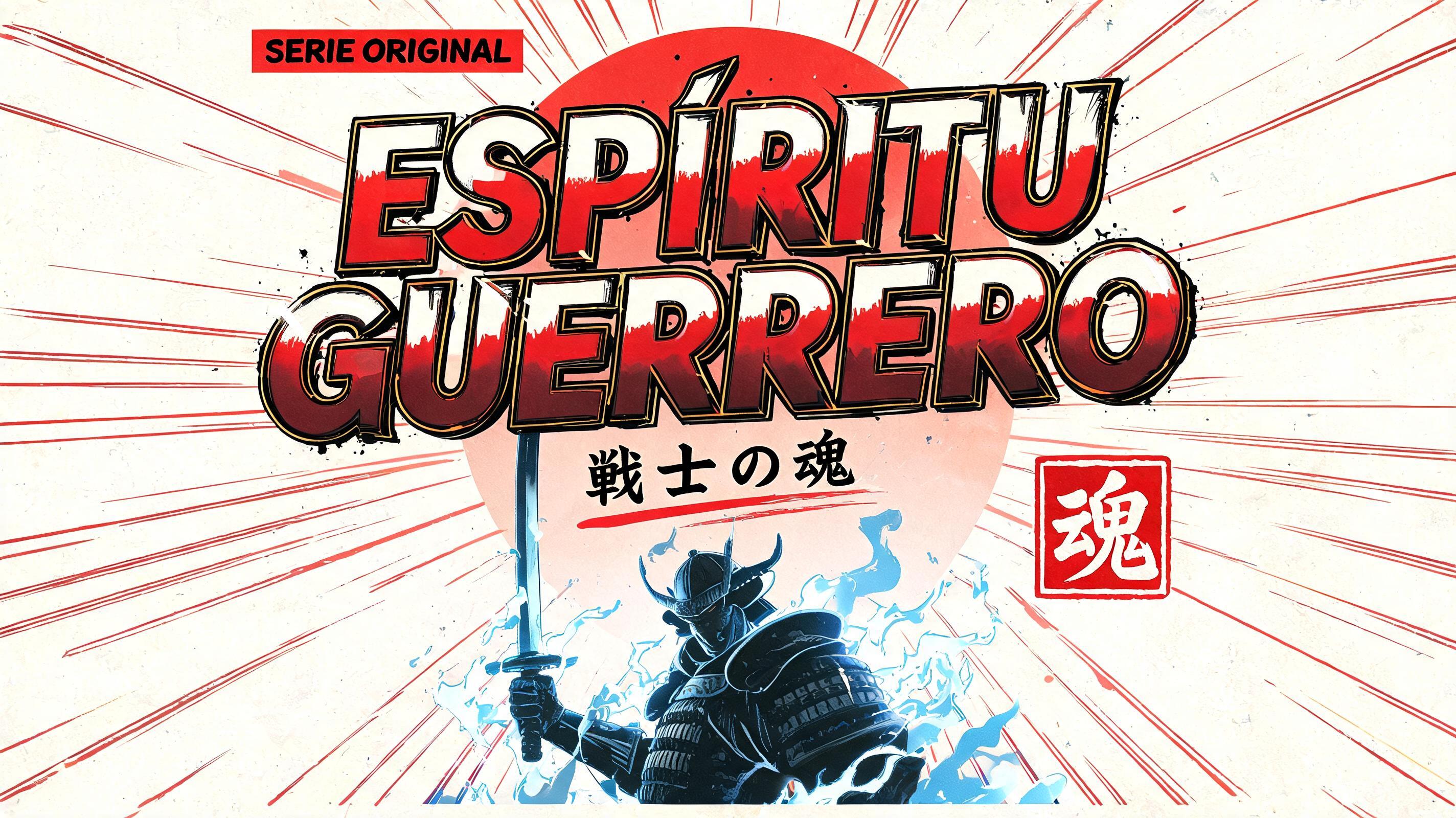
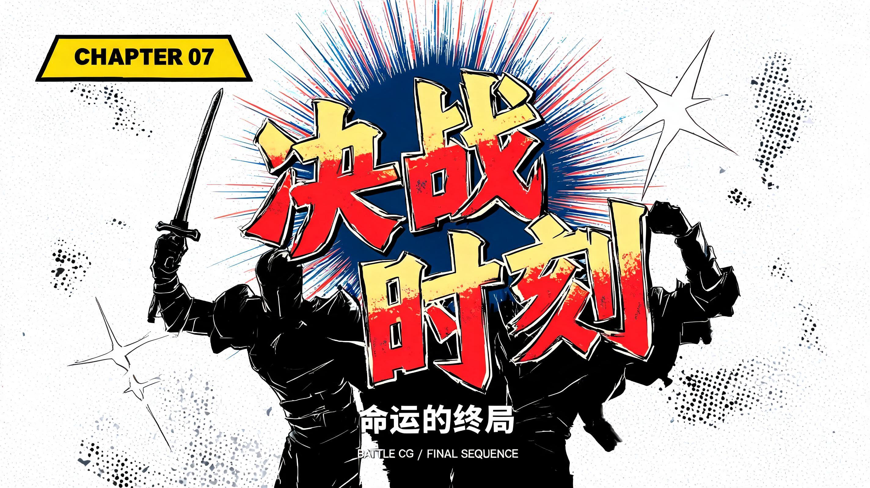
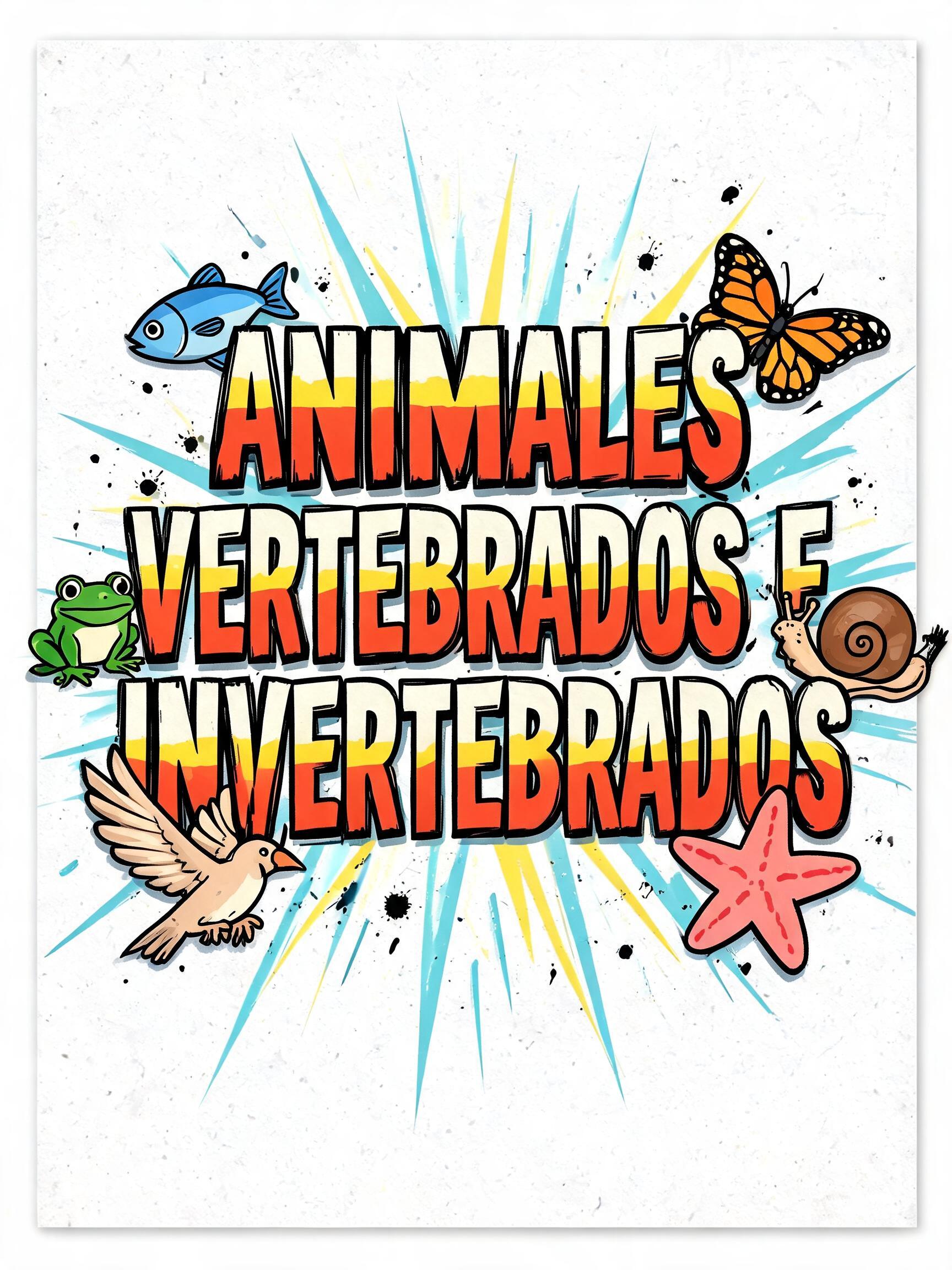
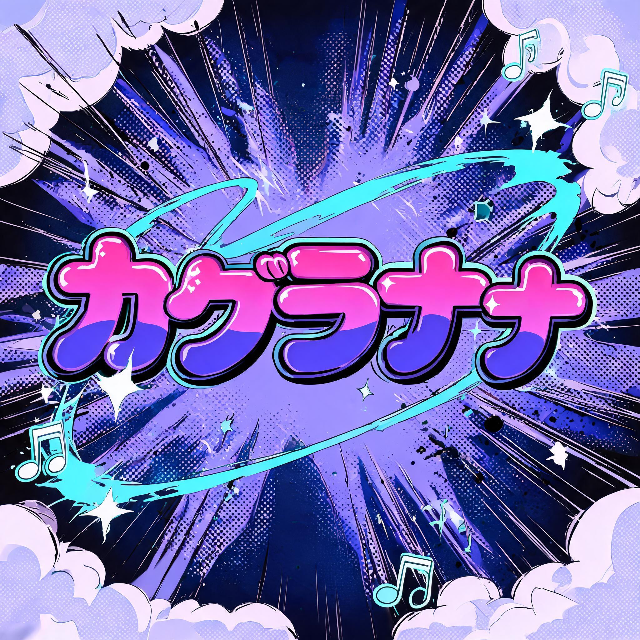
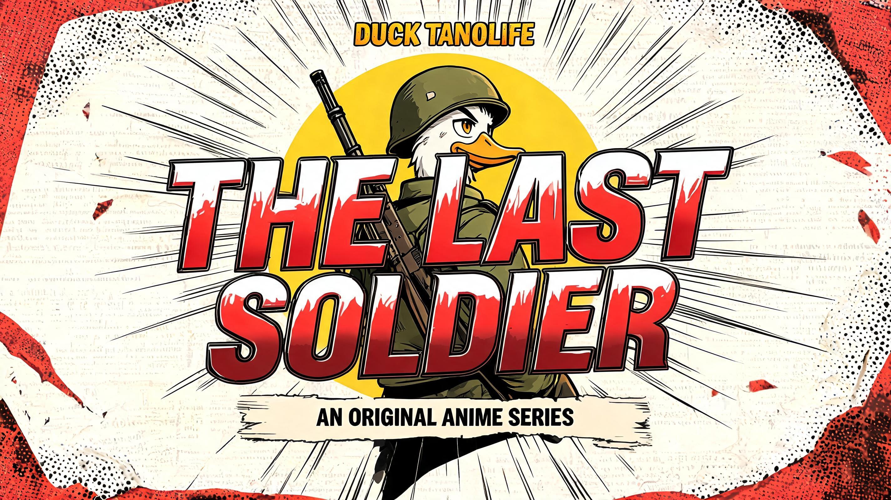
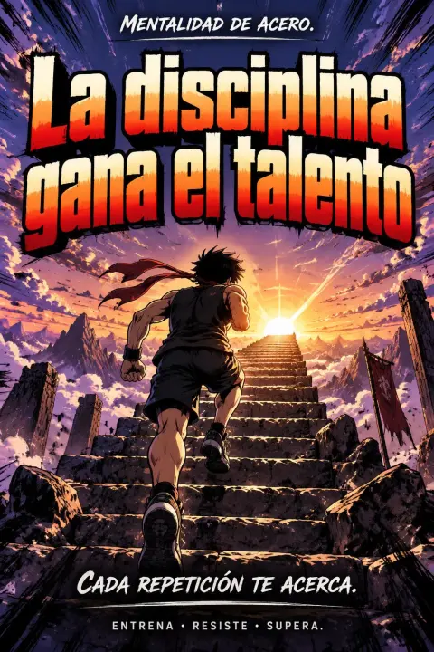
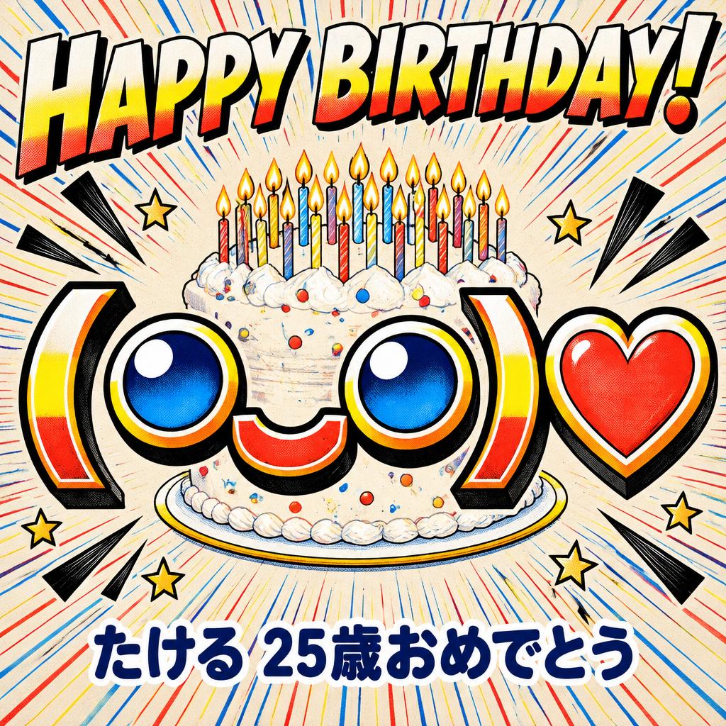
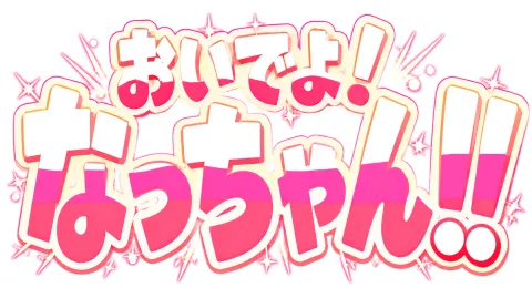
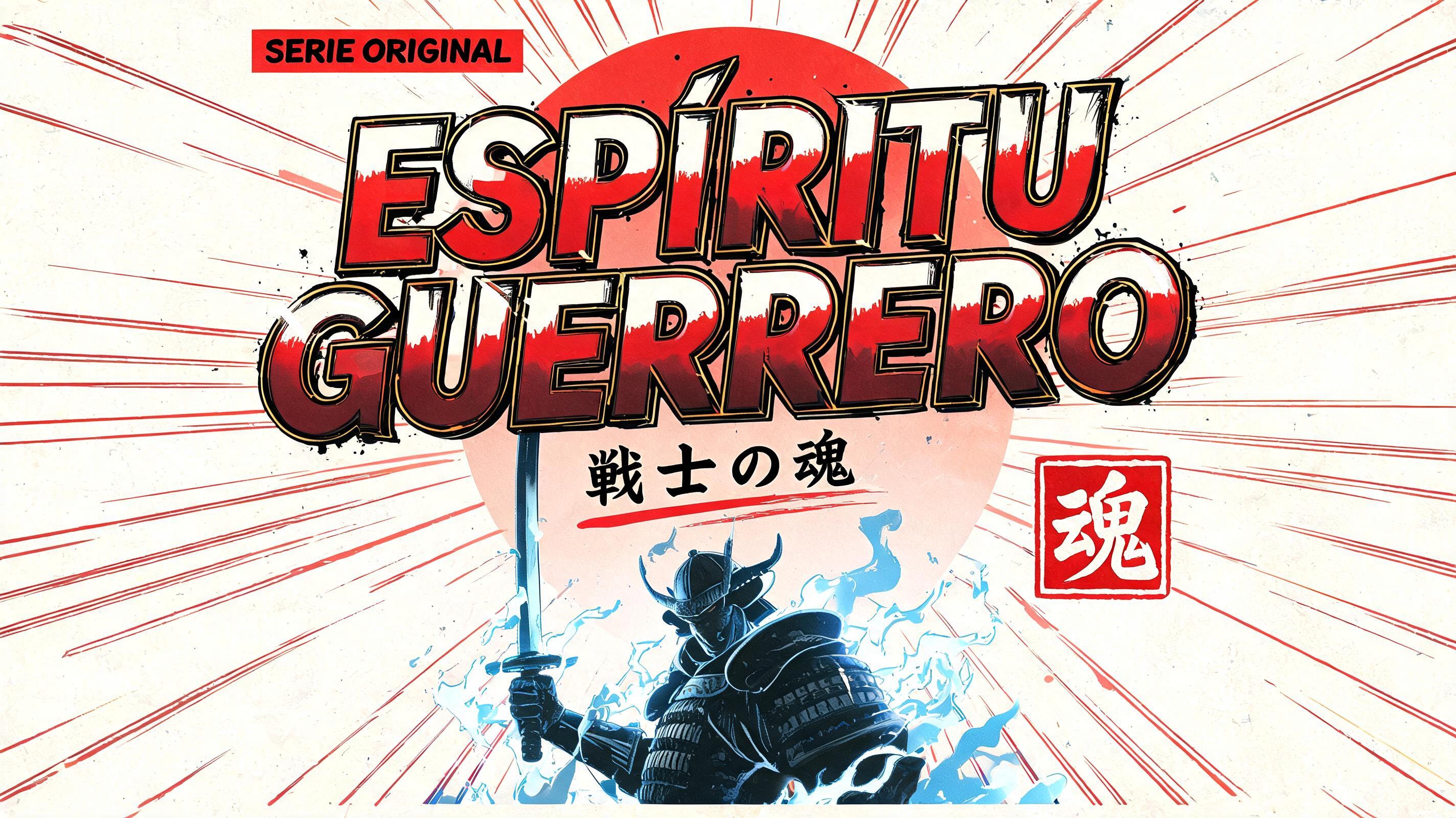
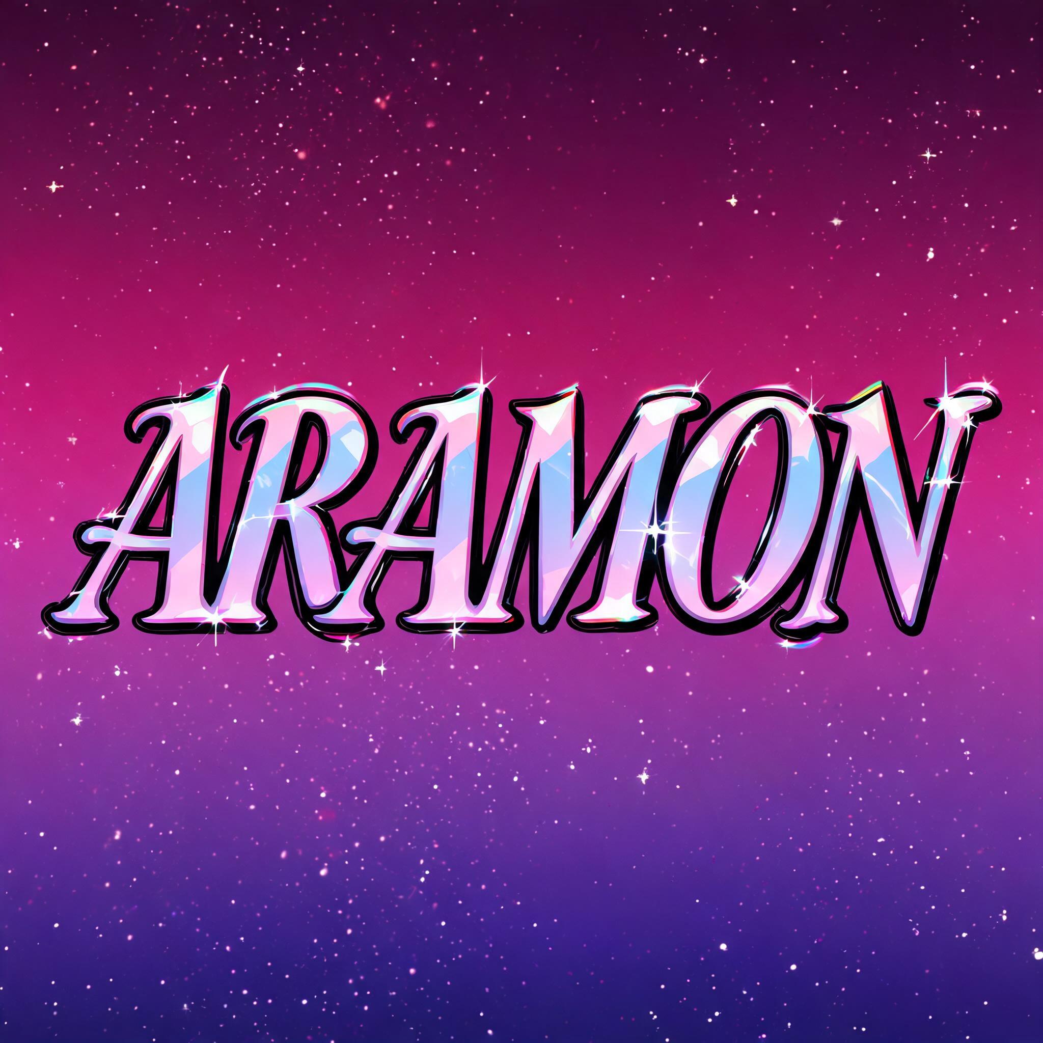
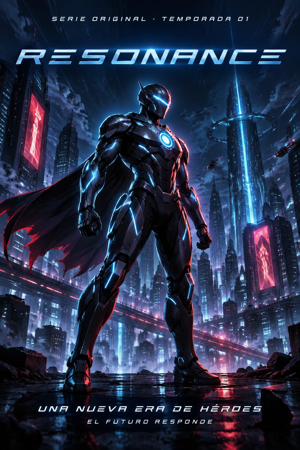
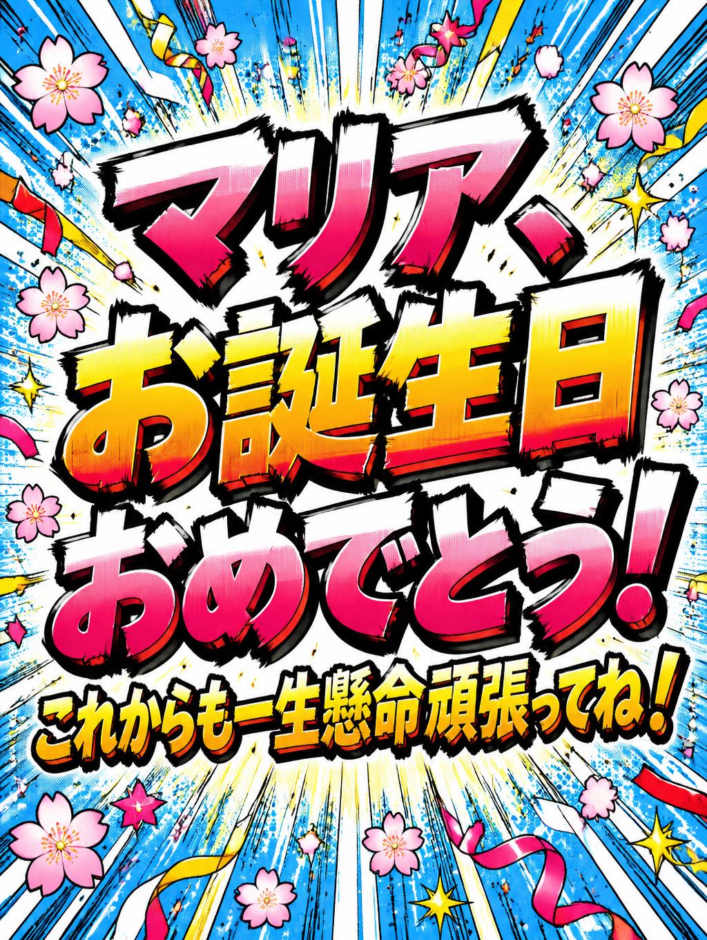
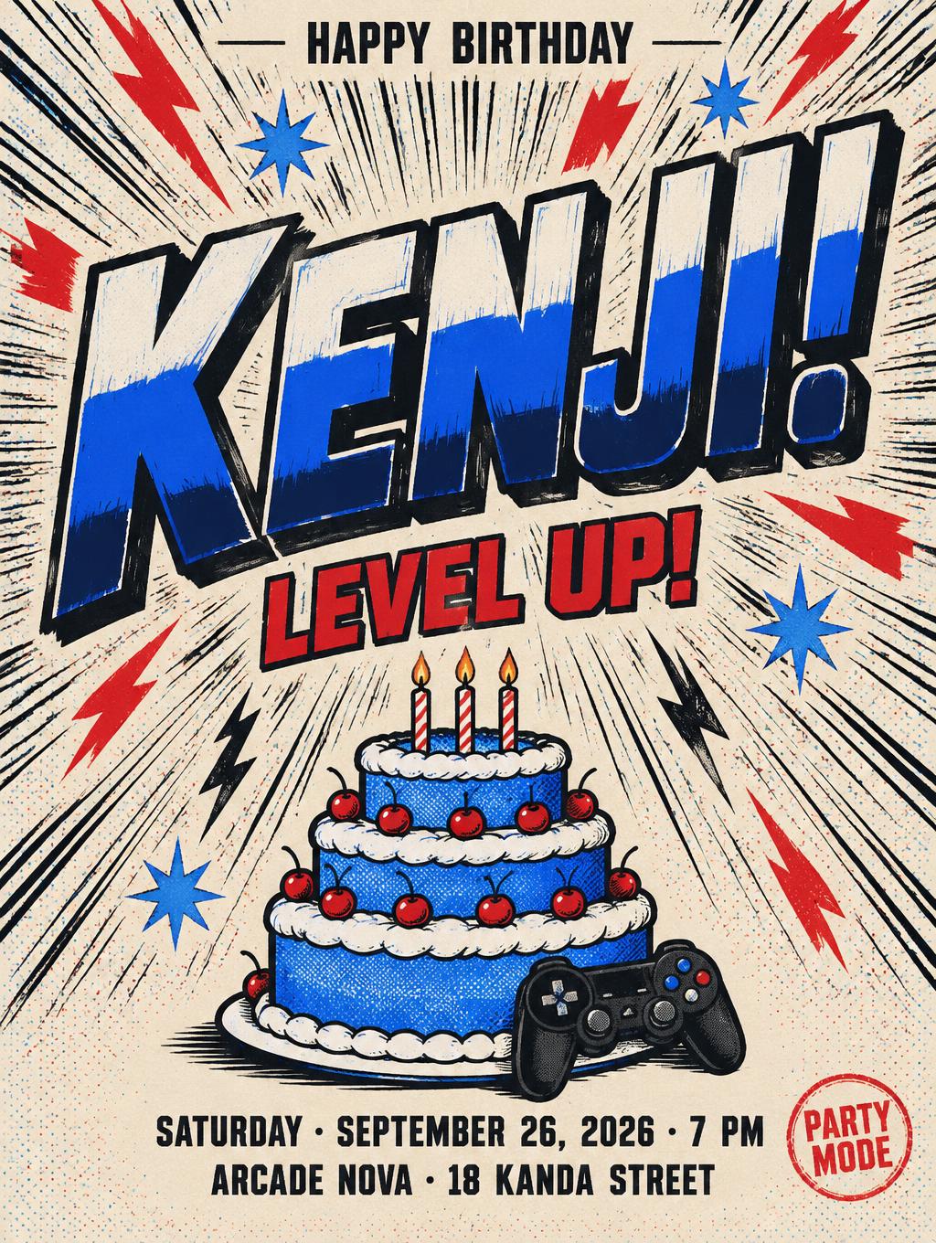
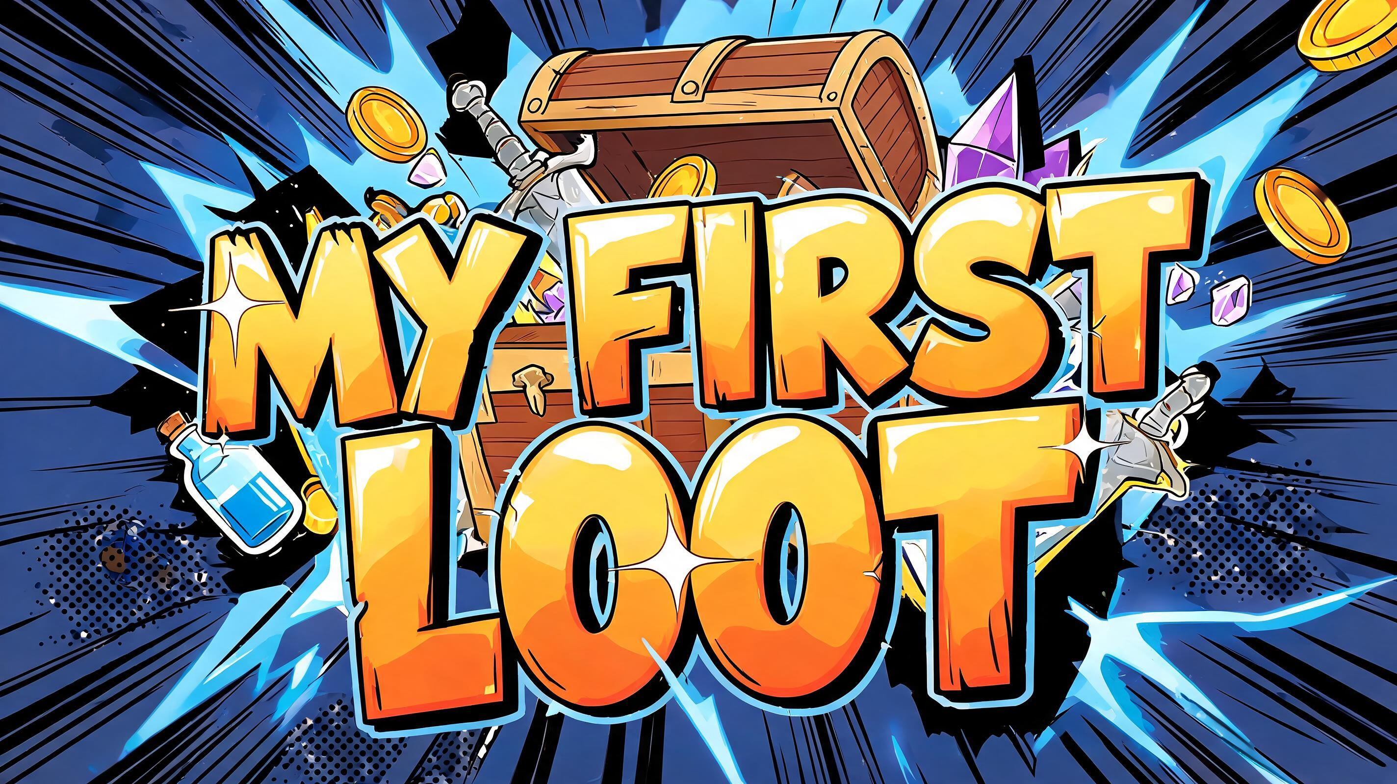
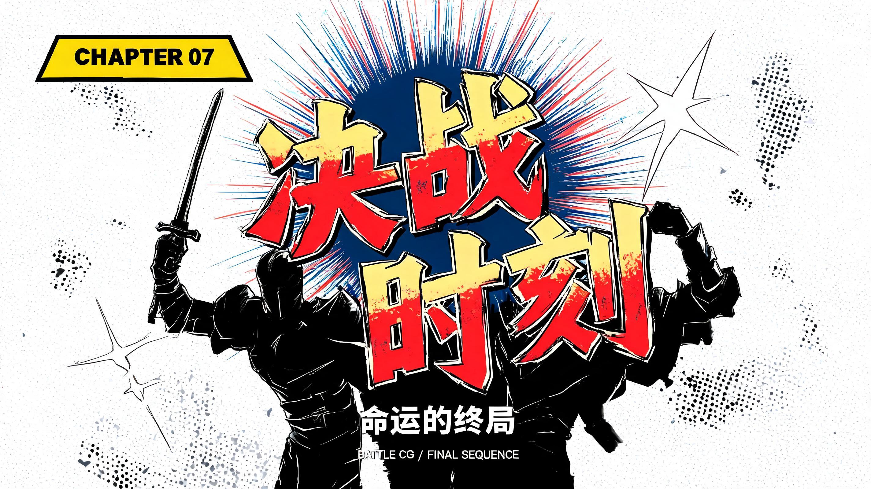
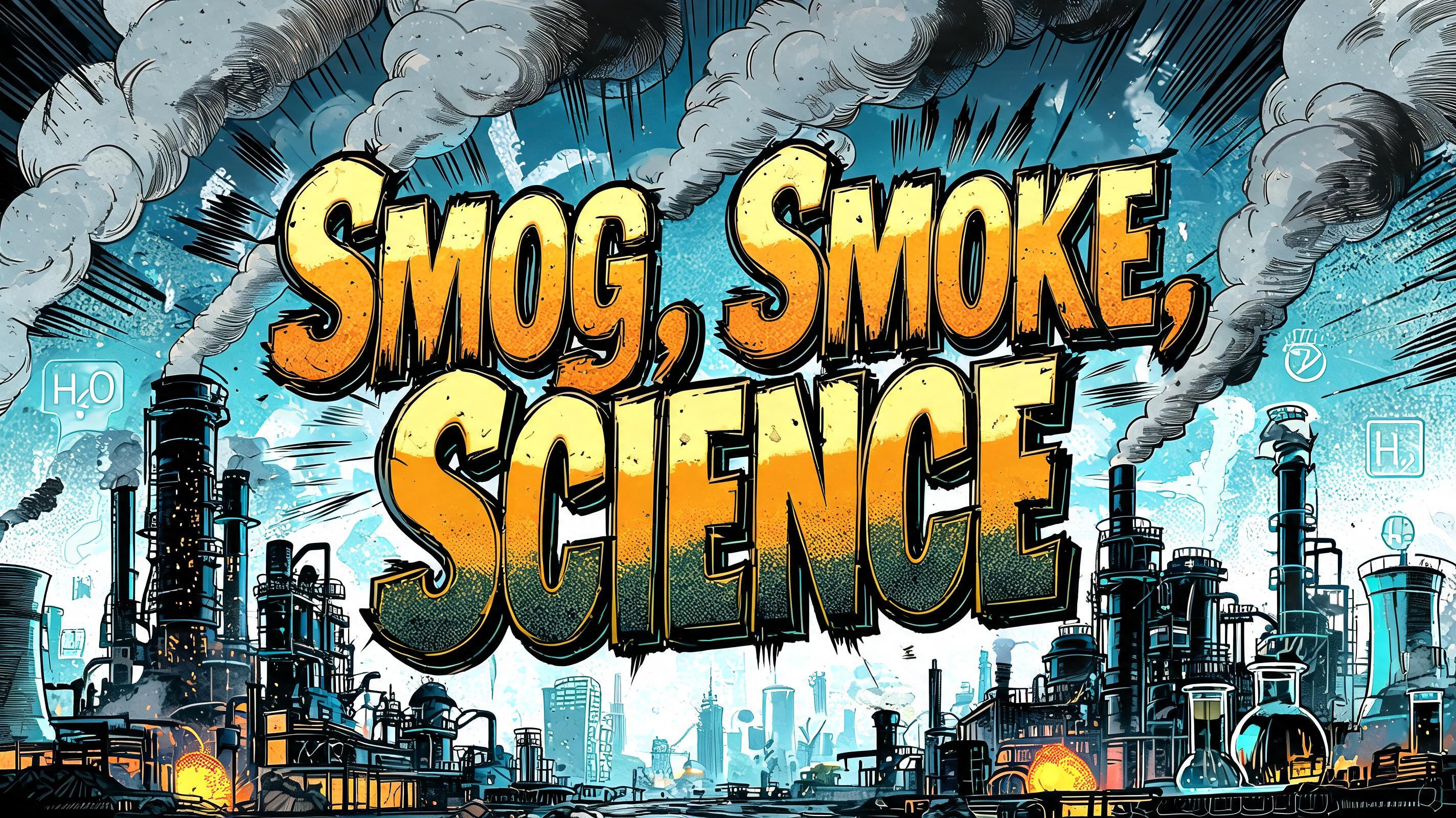
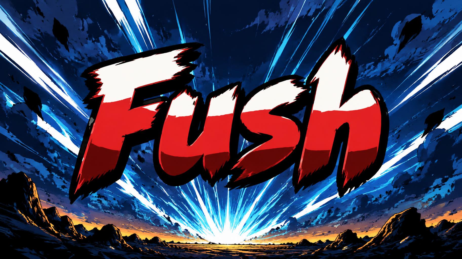
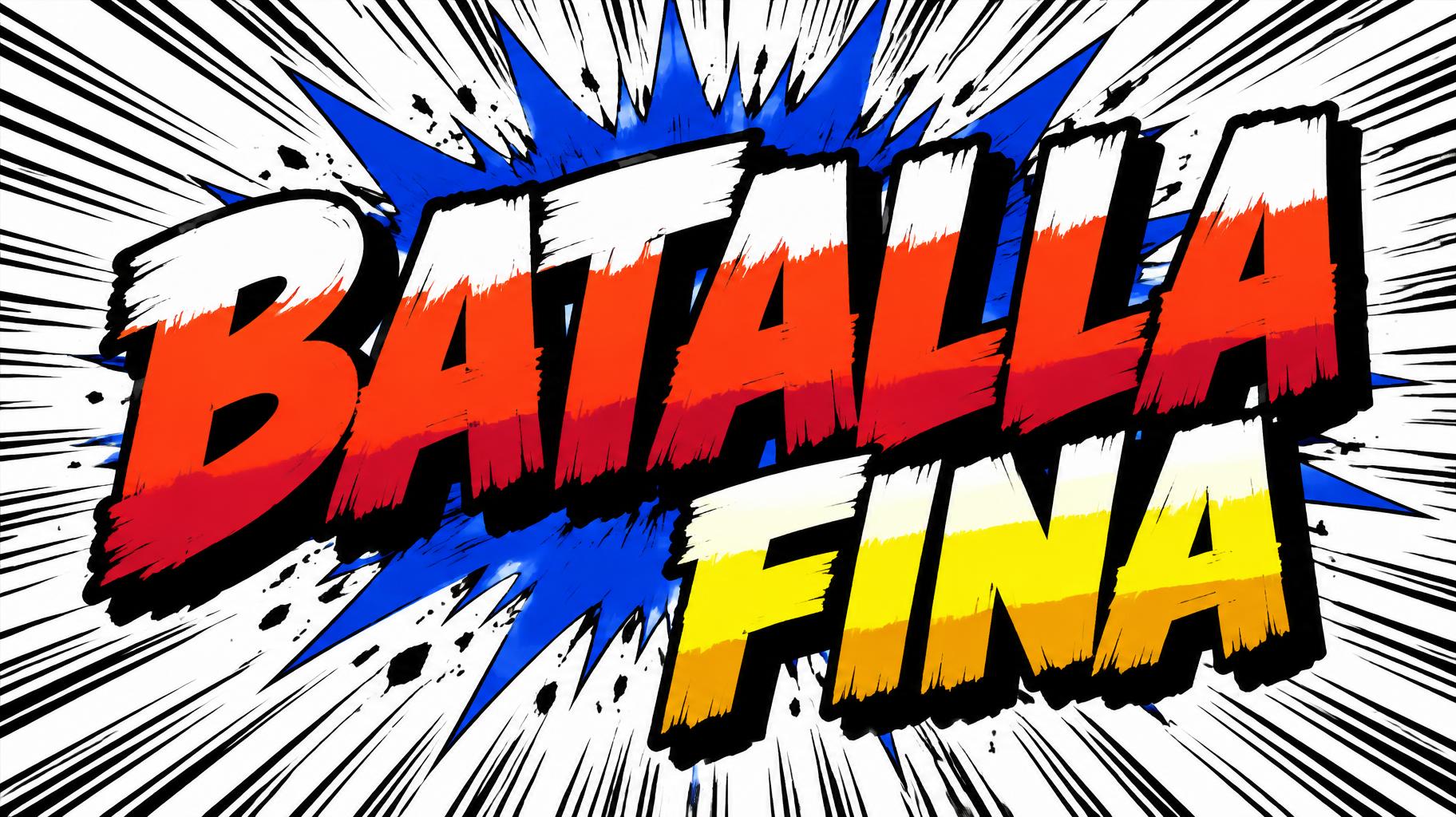
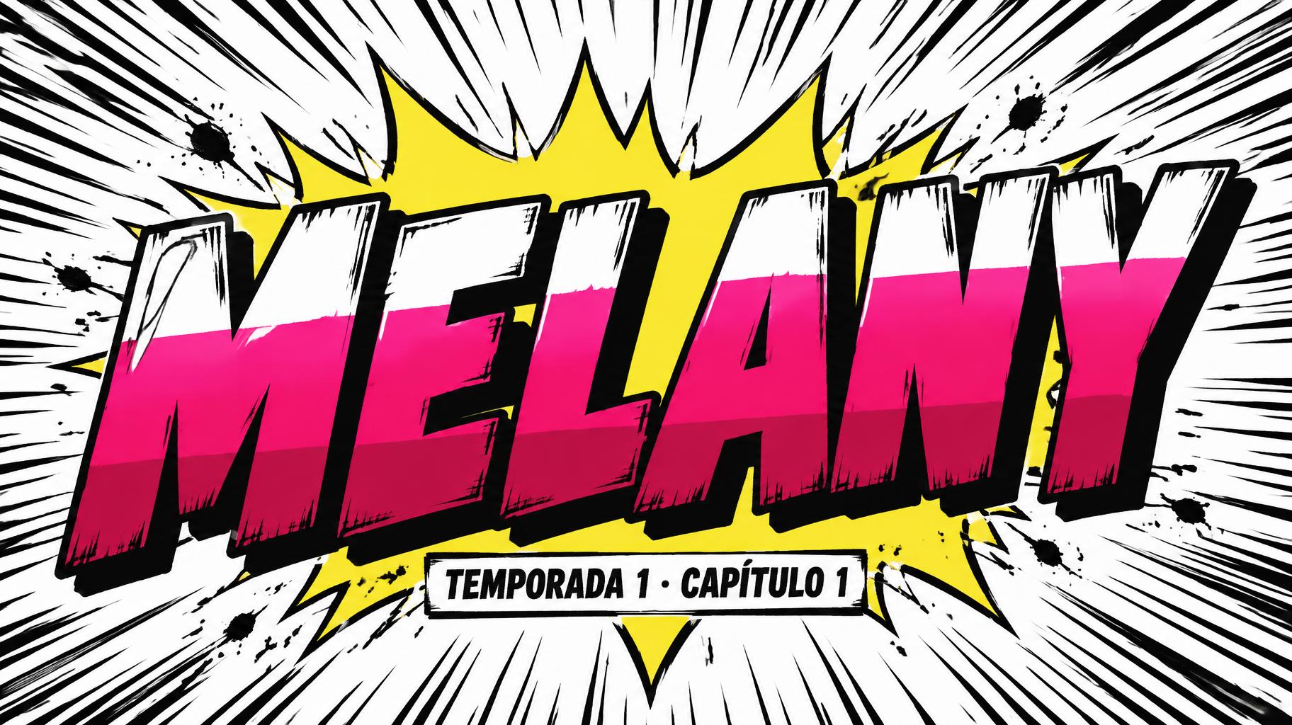
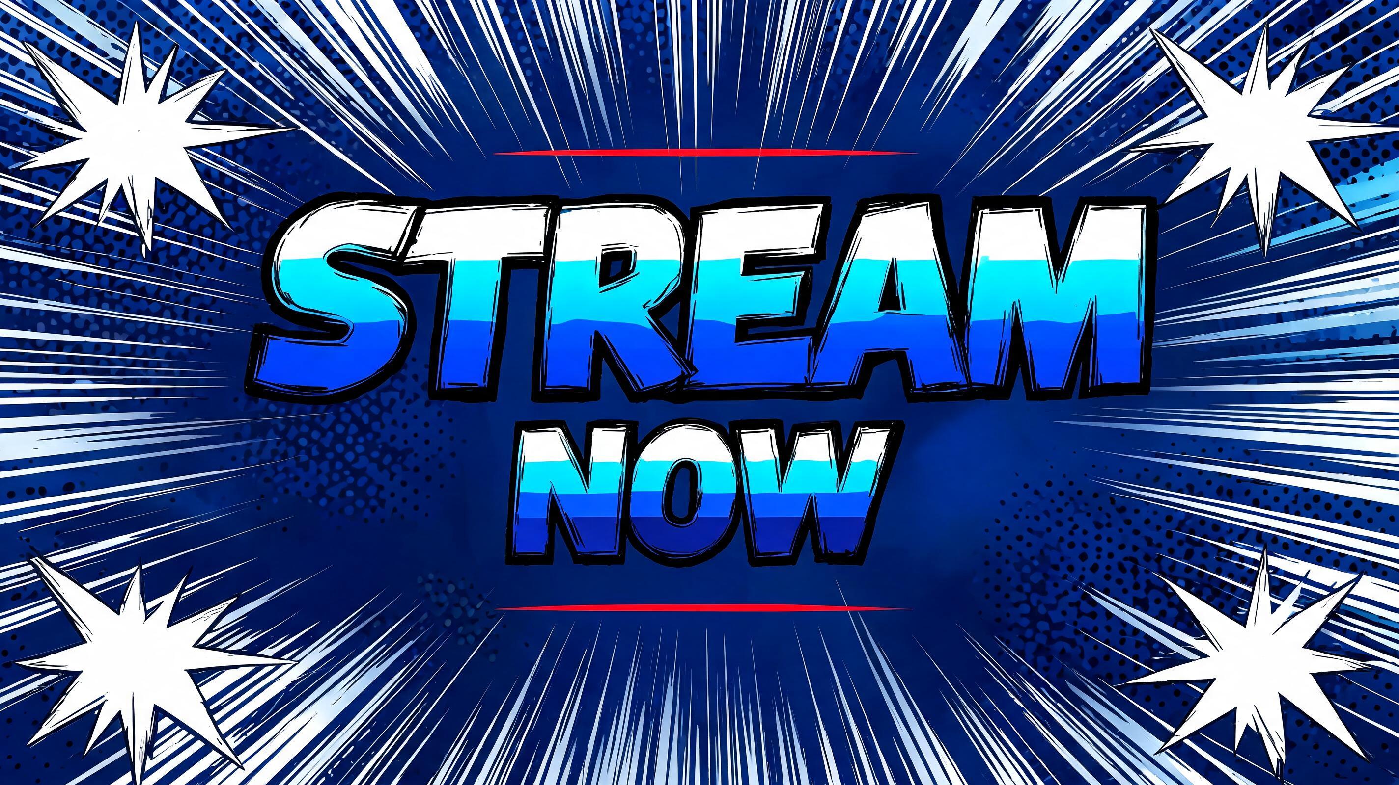
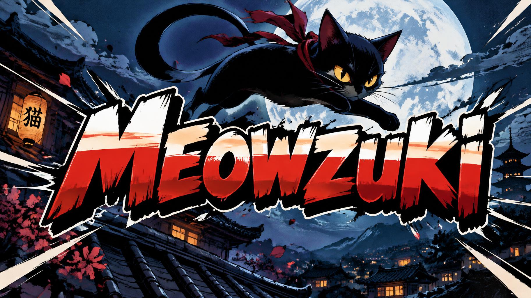
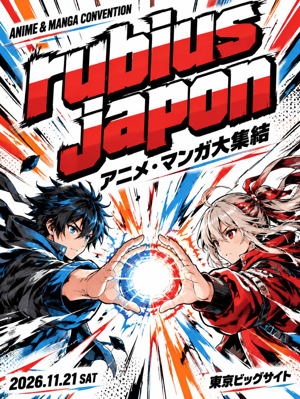
Shounen manga title lettering: heavy hand-inked black outlines, flat cel shading split into hard highlight and shadow bands, slanted dynamic letters on white with radiating speed lines. — no font license needed.
Anime in different AI fonts





What you can make with Anime


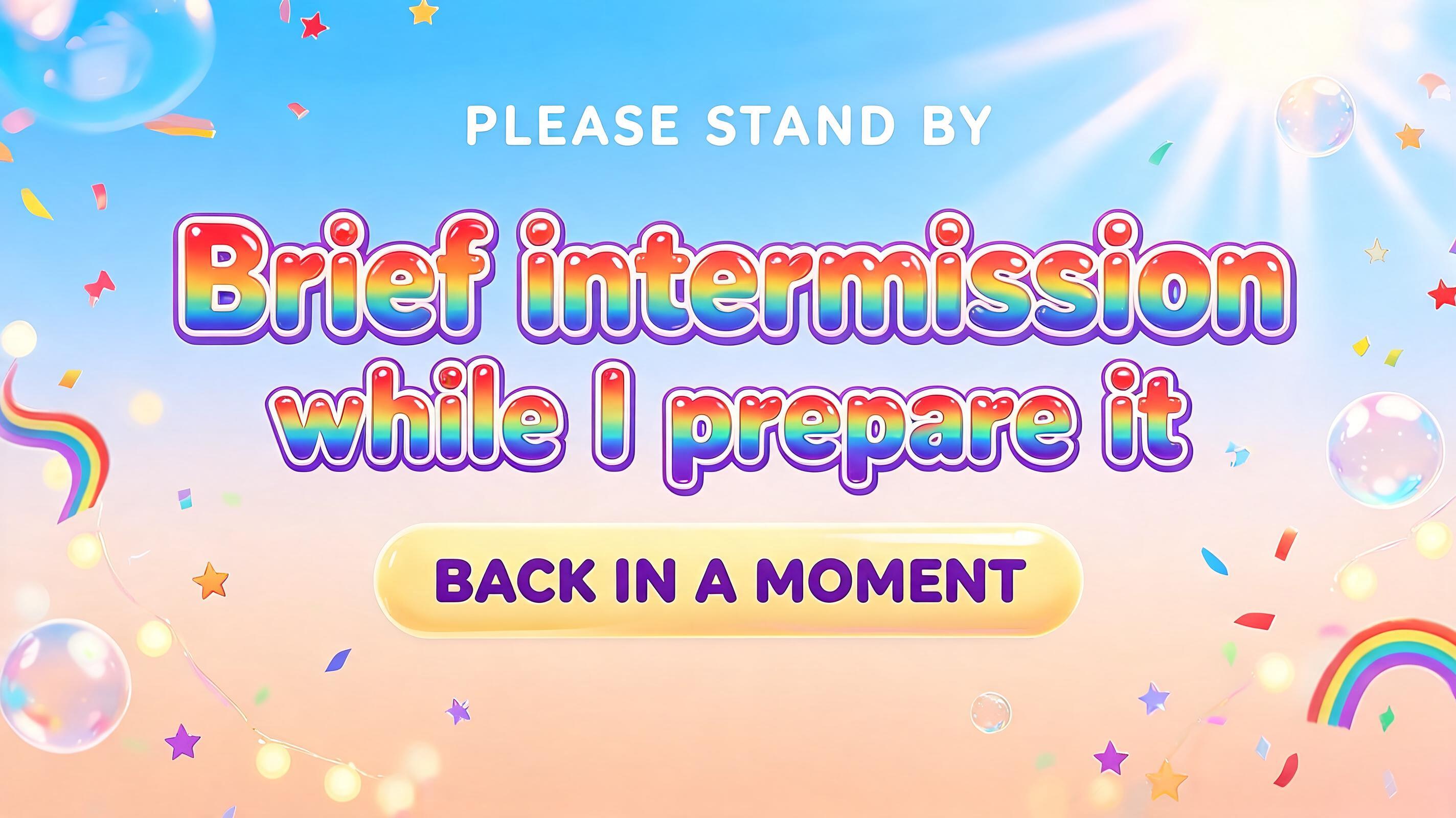
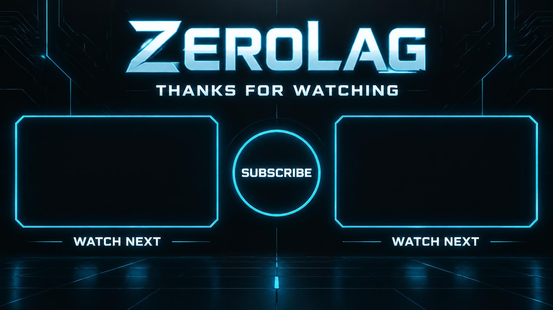
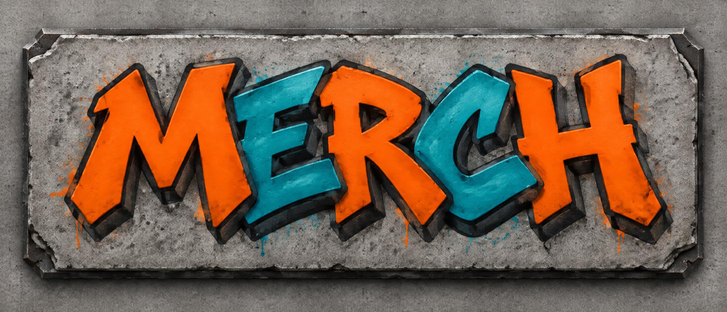
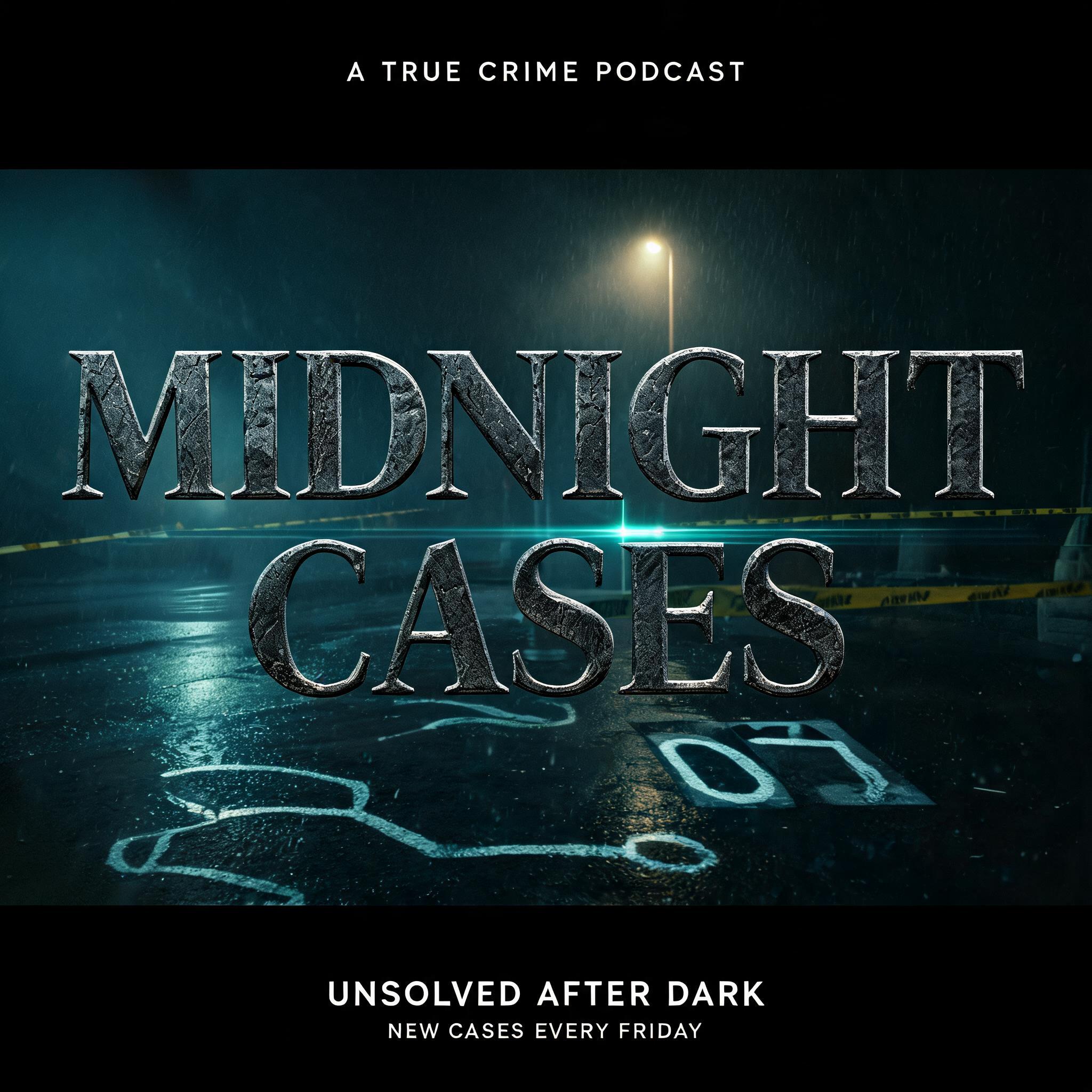
Anime Gallery
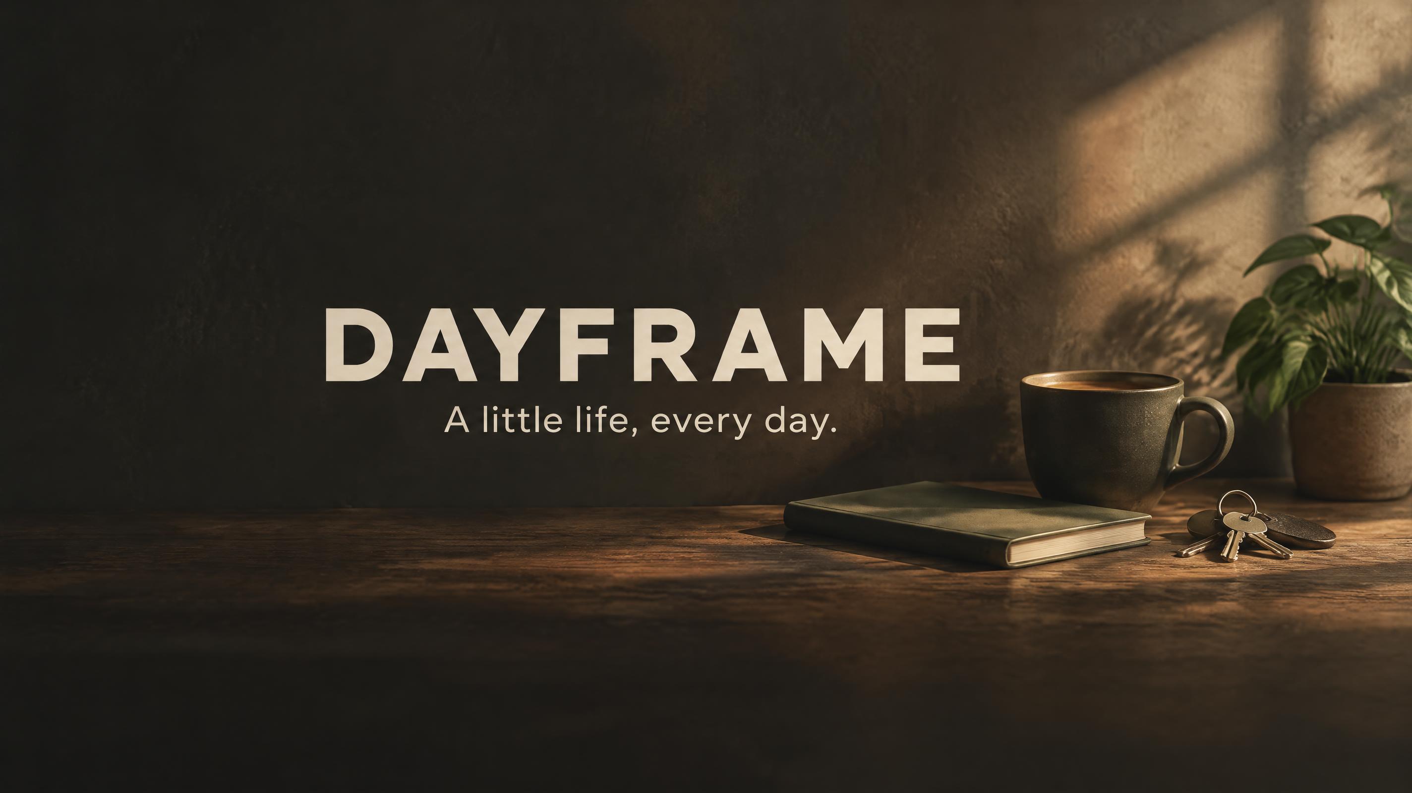
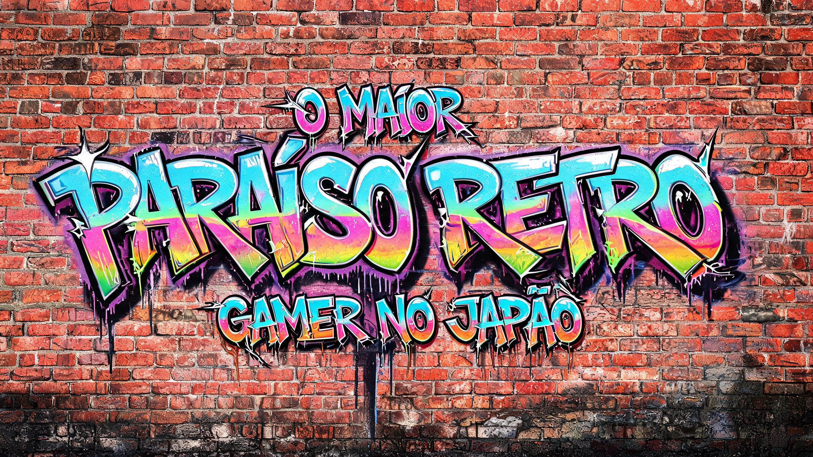
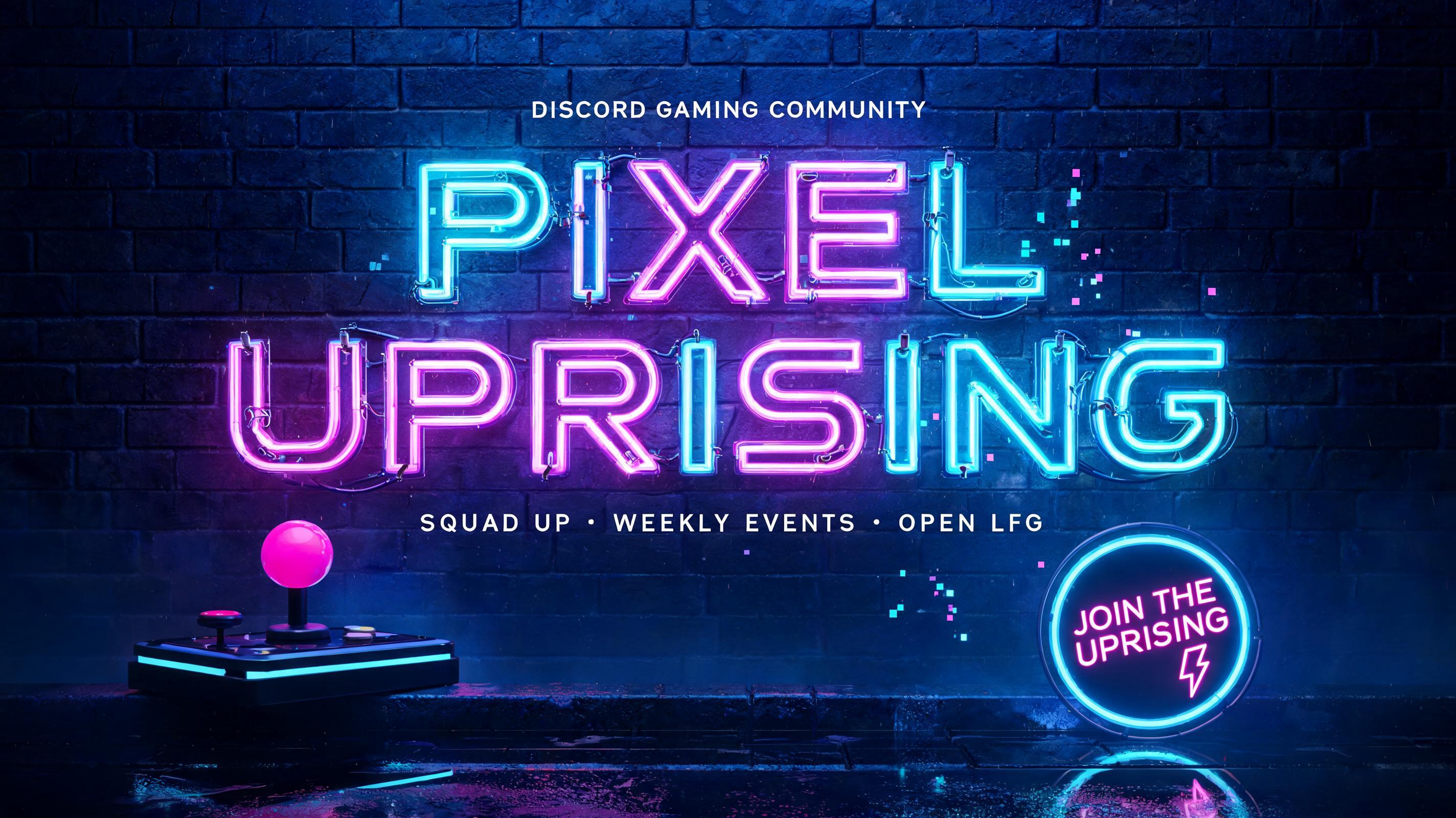
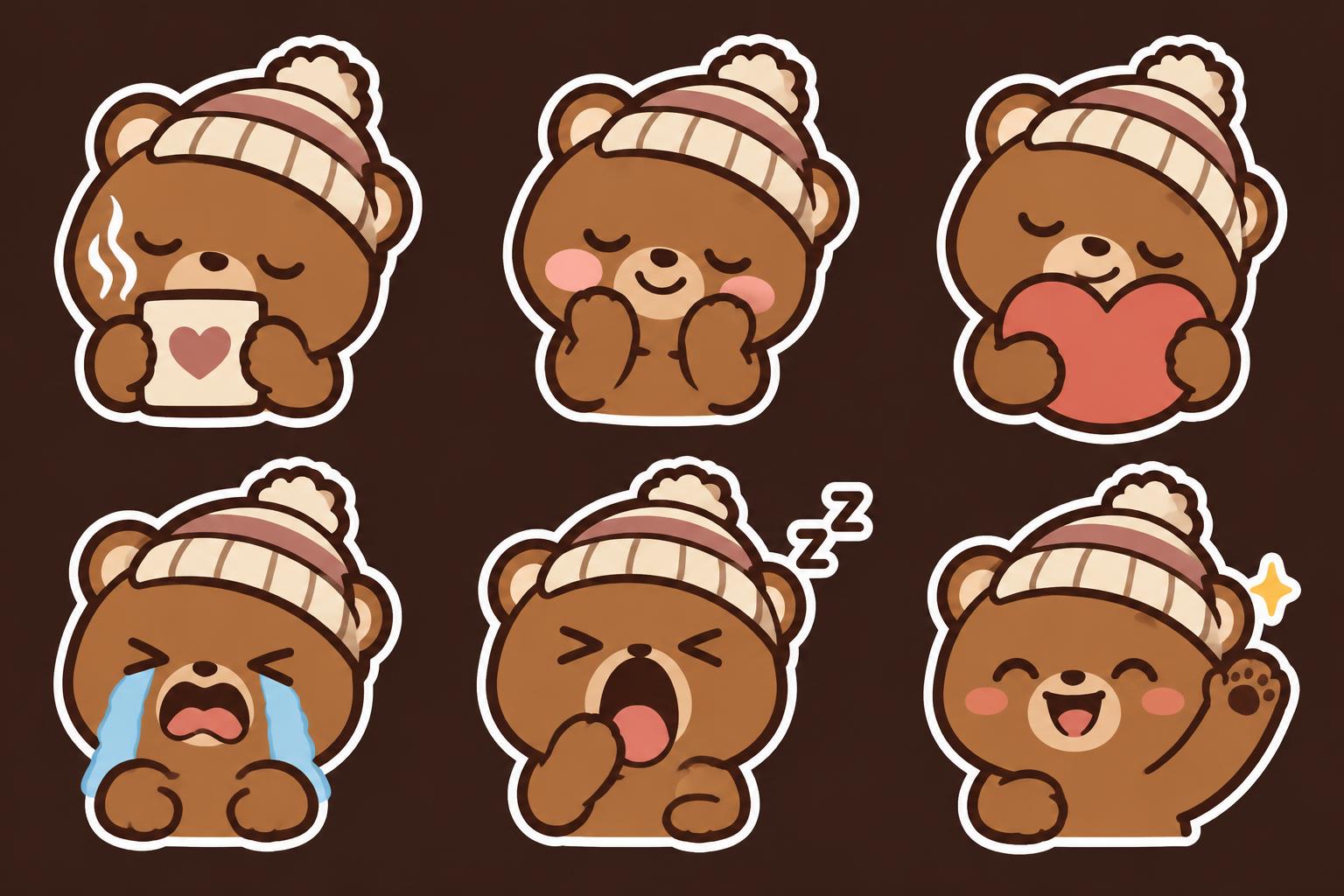
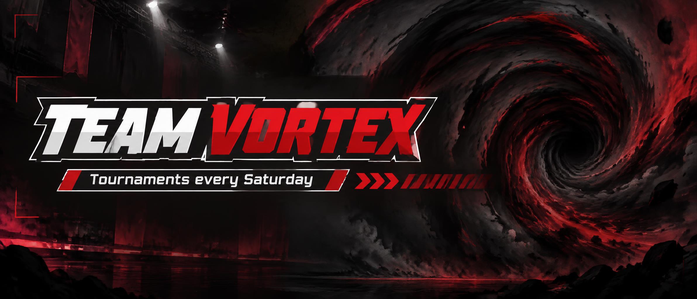
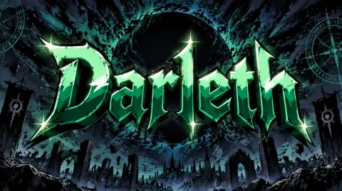
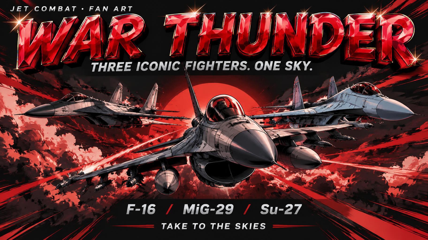
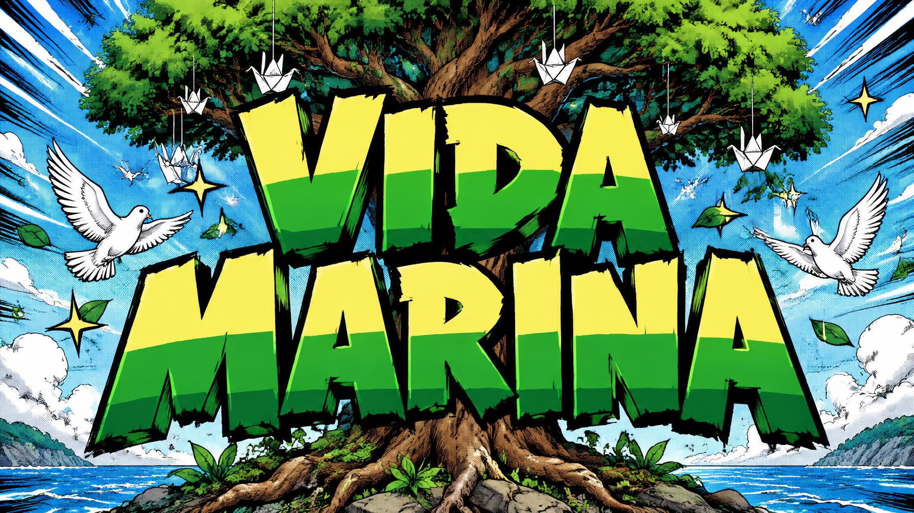
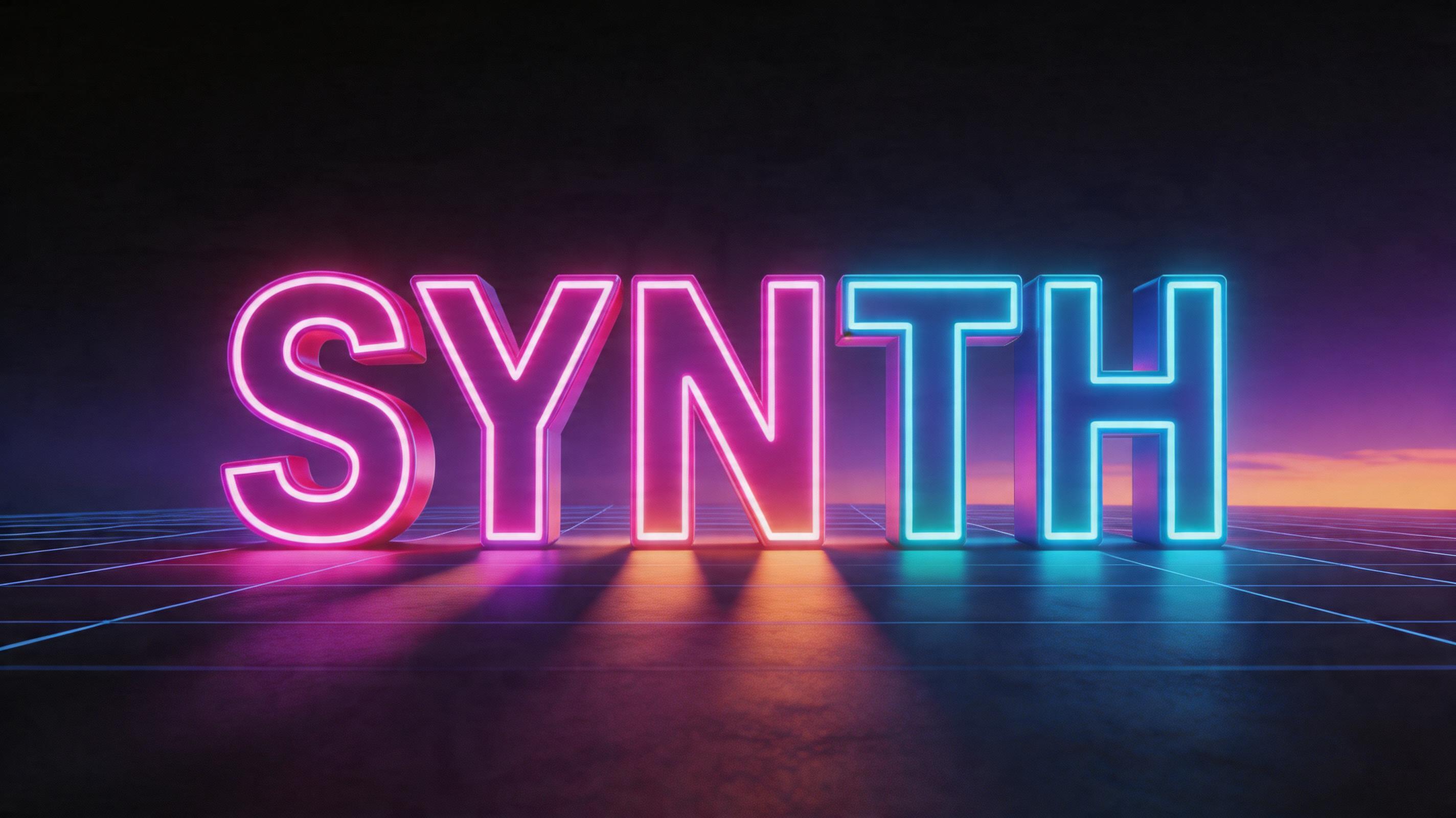
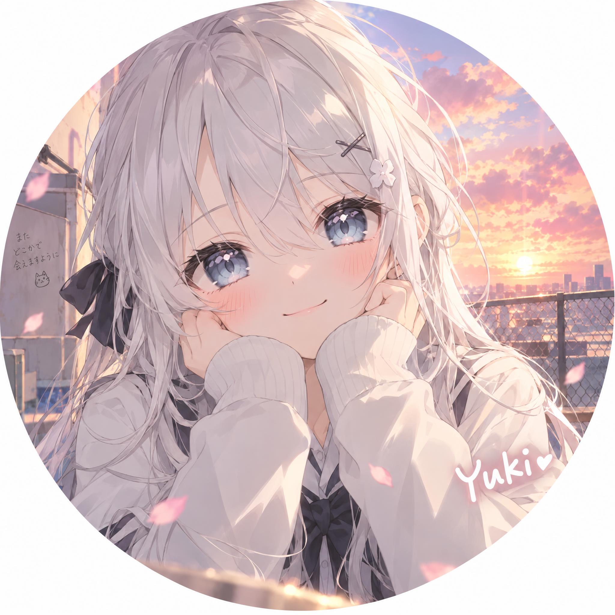
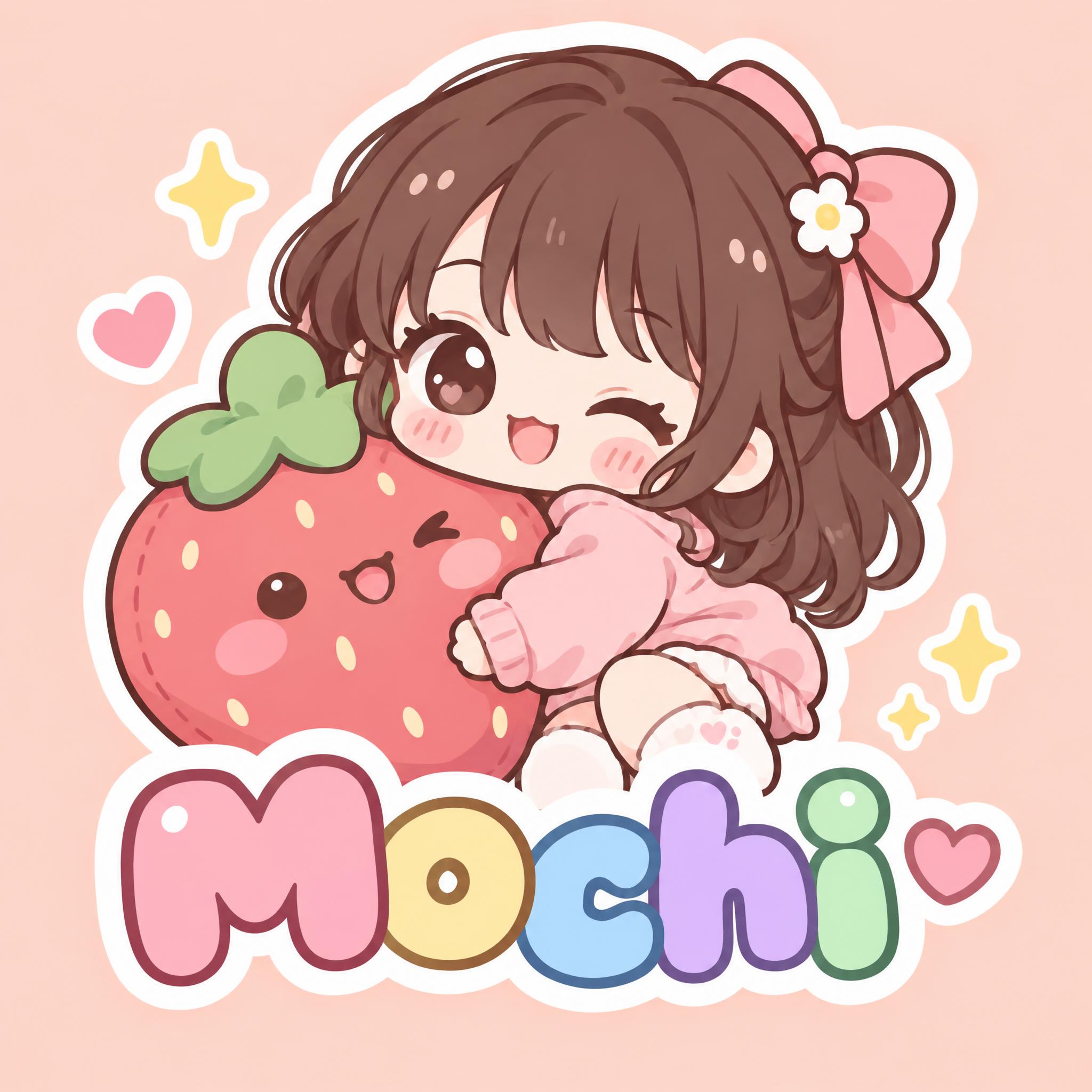
Real outputs from the Anime style. Click any image to see details.









Looking for copy-paste fancy text? Try our free Font Generator Tools — cursive, gothic, bubble & 30+ styles.
Perfect for These Projects
Anime Text Effect — FAQ
What is the Anime Font Style?
The Anime font style is a distinctive AI-generated typography effect. Shounen manga title lettering: heavy hand-inked black outlines, flat cel shading split into hard highlight and shadow bands, slanted dynamic letters on white with radiating speed lines. Using FontVibe's AI anime generator you can create stunning text effects in seconds — no Photoshop, no font licensing, no design experience needed.
Explore the Anime gallery for inspiration, or browse all 138+ AI text effect styles available on FontVibe.
How to Create Anime Typography in FontVibe Studio
The Story Behind Anime
History, visual DNA, and cultural context.
Osamu Tezuka's Shadow Over Everything
The visual language of anime typography begins with one person: Osamu Tezuka, the manga artist who established the visual conventions of Japanese comics in the late 1940s and early 1950s. Tezuka's formal innovation — large expressive eyes drawn from American animation such as Disney's, and cinematic page layouts with pans, close-ups and zooms — created a visual grammar so complete that it became the baseline for an entire national medium.
The specific typographic tradition within anime is different from Western titling conventions. Japanese type design operates across three writing systems simultaneously (hiragana, katakana, kanji), each with different visual properties. Anime title design often uses katakana for its angular, modern quality, or mixes writing systems within a single title for layered effect. When studios produce English-language title cards, they apply the same visual logic: bold, energetic letterforms with the emotional intensity that the narrative demands.
The global spread of anime aesthetics through fansubs, streaming platforms, and gaming culture has created a recognizable international visual vocabulary: the speed line, the impact frame, the dramatic title card typography. These elements travel without language barrier because they operate through visual convention rather than linguistic content.
Sources: Wikipedia — Osamu Tezuka
The Visual DNA
Did You Know?
The large eyes that define anime character design trace back to Osamu Tezuka, who drew on American animation such as Betty Boop and Disney's Bambi — a film he watched more than 80 times — as well as the eyes of the stage characters of the Takarazuka Revue. Japanese manga and anime then developed this borrowing into a visual language that has since influenced animation worldwide. Source ↗
Create Your Anime Typography in Studio
Free to start. No design skills needed. Your artwork, your copyright.
AI Anime Text Effect Generator
Shounen manga title lettering: heavy hand-inked black outlines, flat cel shading split into hard highlight and shadow bands, slanted dynamic letters on white with radiating speed lines. — no font license needed.
Anime in different AI fonts
What you can make with Anime
Generate Your Anime Text Effect
Type any word — see it transformed in seconds. No sign-up required.
Anime Style Gallery
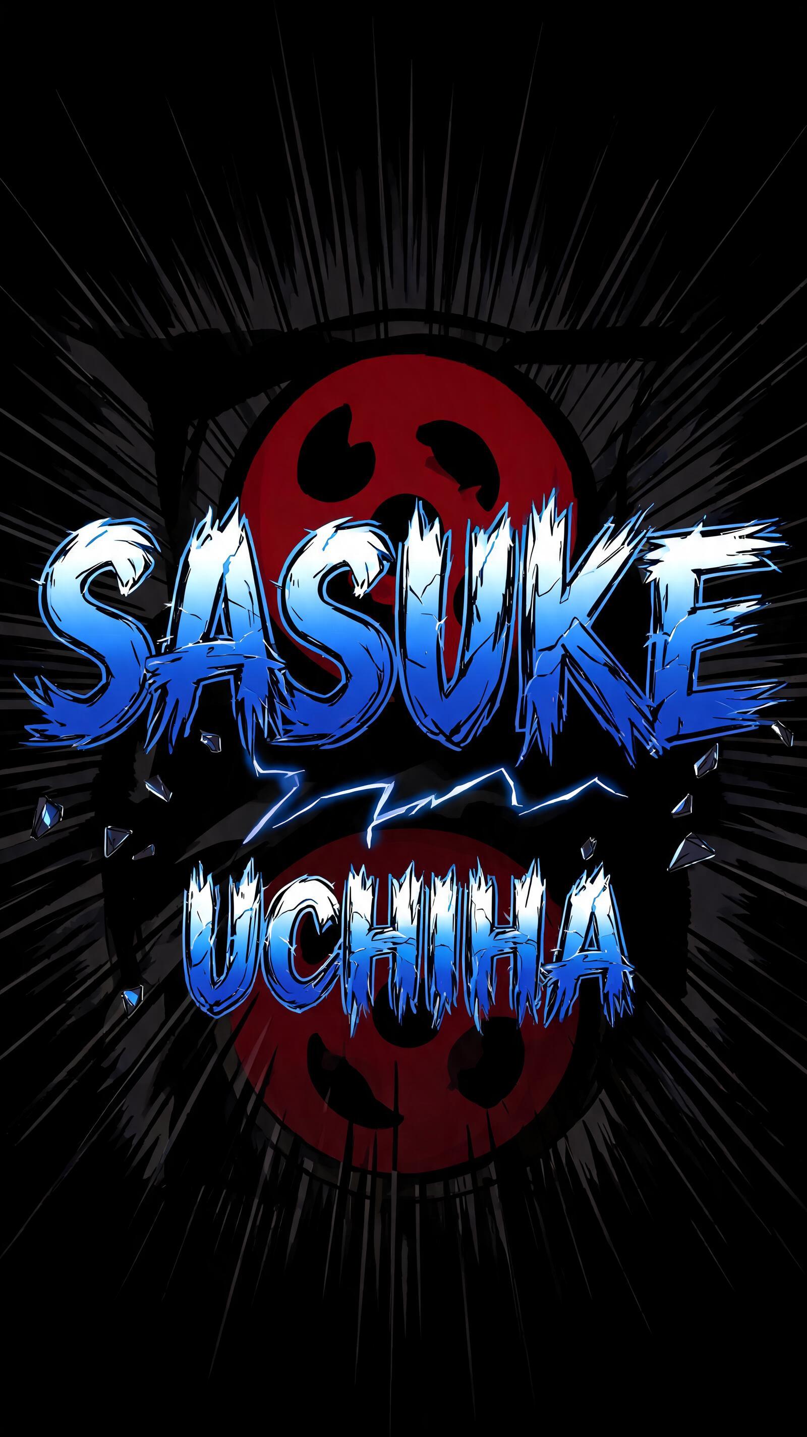
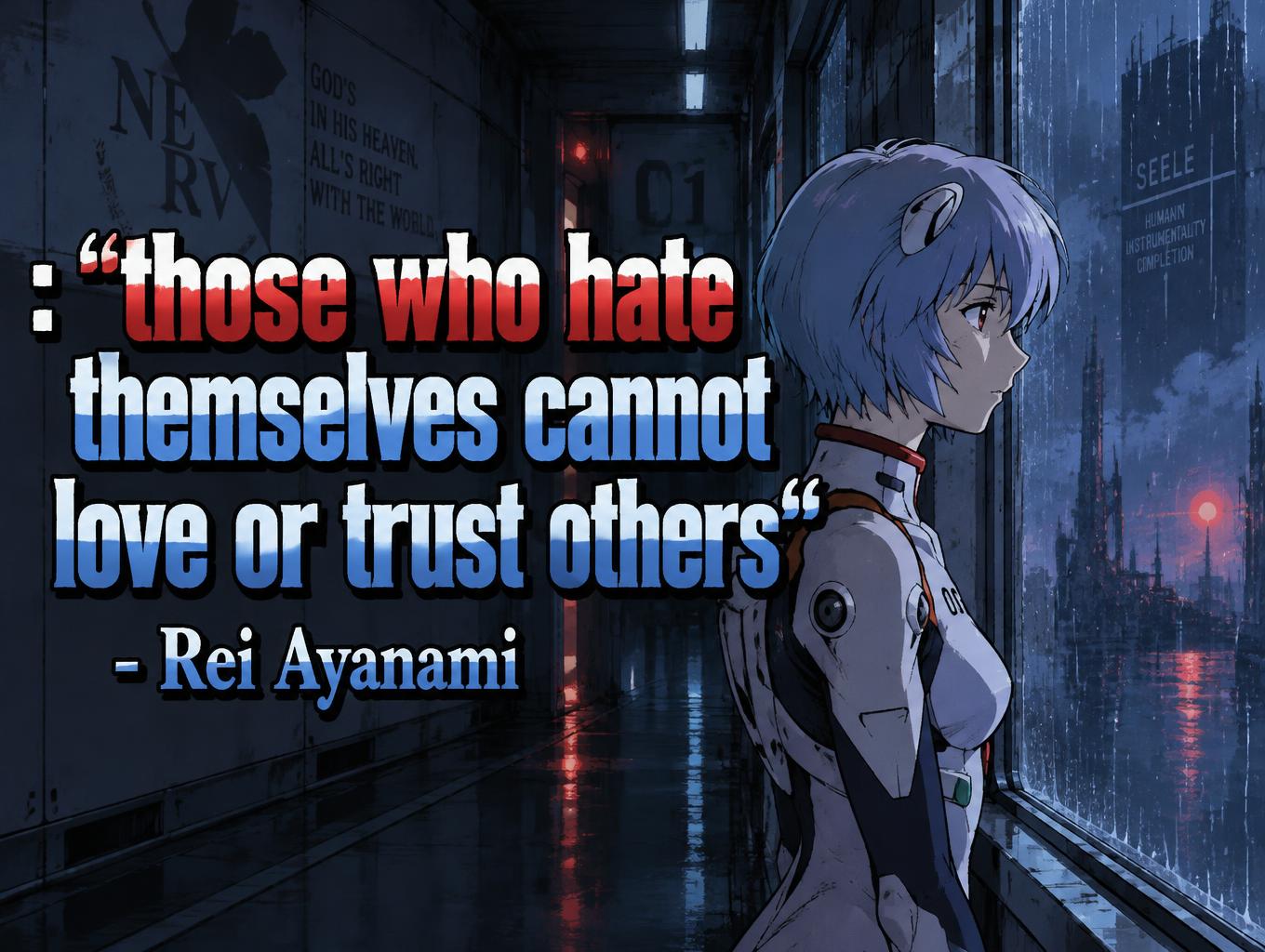
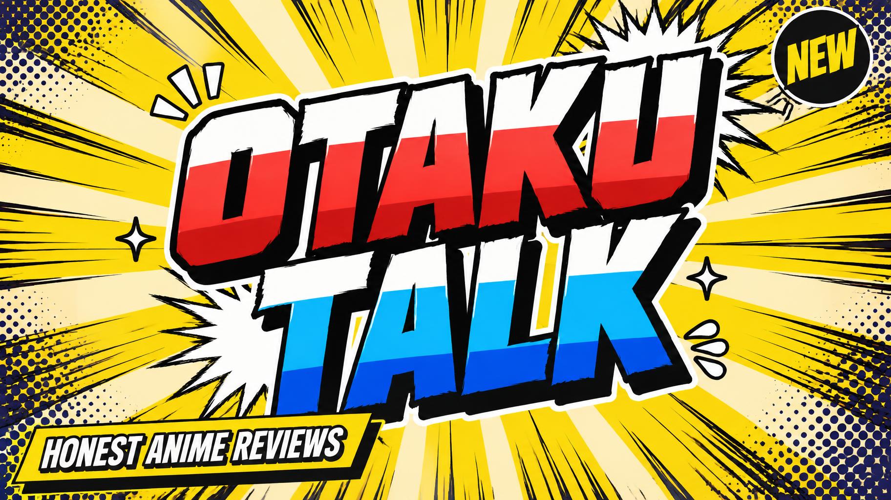
Real outputs from the Anime style. Click any image to see details.






Similar Text Effect Styles
Try these styles and create your own AI-generated text effects.
Looking for copy-paste fancy text? Try our free Font Generator Tools — cursive, gothic, bubble & 30+ styles.
Perfect for These Projects
Anime text effects are popular for creative projects where visual impact matters.
What is the Anime Font Style?
The Anime font style is a distinctive AI-generated typography effect. Shounen manga title lettering: heavy hand-inked black outlines, flat cel shading split into hard highlight and shadow bands, slanted dynamic letters on white with radiating speed lines.
Using FontVibe's AI anime generator you can create stunning text effects in seconds — no Photoshop, no font licensing, no design experience needed.
Explore the Anime gallery for inspiration, or browse all 138+ AI text effect styles available on FontVibe.
How to Create Anime Typography in FontVibe Studio
1. Enter your text — Any word, phrase, or brand name. Works best with short, punchy text.
2. Select Anime — From the style library. Optionally describe a mood in the custom prompt.
3. Generate and download. Your Anime font artwork is ready in seconds. PNG, JPG, or transparent PNG.
Looking for something different? Browse the full font style library for more AI typography options.
Anime Text Effect — FAQ
The Story Behind Anime
History, visual DNA, and cultural context — everything that makes this style what it is.
Osamu Tezuka's Shadow Over Everything
The visual language of anime typography begins with one person: Osamu Tezuka, the manga artist who established the visual conventions of Japanese comics in the late 1940s and early 1950s. Tezuka's formal innovation — large expressive eyes drawn from American animation such as Disney's, and cinematic page layouts with pans, close-ups and zooms — created a visual grammar so complete that it became the baseline for an entire national medium.
The specific typographic tradition within anime is different from Western titling conventions. Japanese type design operates across three writing systems simultaneously (hiragana, katakana, kanji), each with different visual properties. Anime title design often uses katakana for its angular, modern quality, or mixes writing systems within a single title for layered effect. When studios produce English-language title cards, they apply the same visual logic: bold, energetic letterforms with the emotional intensity that the narrative demands.
The global spread of anime aesthetics through fansubs, streaming platforms, and gaming culture has created a recognizable international visual vocabulary: the speed line, the impact frame, the dramatic title card typography. These elements travel without language barrier because they operate through visual convention rather than linguistic content.
Sources: Wikipedia — Osamu Tezuka
The Visual DNA
Did You Know?
The large eyes that define anime character design trace back to Osamu Tezuka, who drew on American animation such as Betty Boop and Disney's Bambi — a film he watched more than 80 times — as well as the eyes of the stage characters of the Takarazuka Revue. Japanese manga and anime then developed this borrowing into a visual language that has since influenced animation worldwide. Source ↗